Introduction
Overview
Teaching: min
Exercises: minQuestions
Objectives
What is machine learning?
Machine learning is a set of of tools and techniques which let us find patterns in data. This lesson will introduce you to a few of these techniques, but there are many more which we simply don’t have time to cover here.
The techniques breakdown into two broad categories, predictors and classifiers. Predictors are used to predict a value (or set of value) given a set of inputs, for example trying to predict the cost of something given the economic conditions and the cost of raw materials or predicting a country’s GDP given its life expectancy. Classifiers try to classify data into different categories, for example deciding what characters are visible in a picture of some writing or if a message is spam or not.
Training Data
Many (but not all) machine learning systems “learn” by taking a series of input data and output data and using it to form a model. The maths behind the machine learning doesn’t care what the data is as long as it can represented numerically or categorised. Some examples might include:
- predicting a person’s weight based on their height
- predicting commute times given traffic conditions
- predicting house prices given stock market prices
- classifying if an email is spam or not
- classifying what if an image contains a person or not
Typically we will need to train our models with hundreds, thousands or even millions of examples before they work well enough to do any useful predictions or classifications with them.
Some systems will do training as a one shot process which produces a model. Others might try to continuosly refine their training through the real use of the system and human feedback to it. For example every time you mark an email as spam or not spam you are probably contributing to further training of your spam filter’s model.
Types of output
Predictors will usually involve a continuos scale of outputs, such as the price of something. Classifiers will tell you which class (or classes) are present in the data. For example a system to recognise hand writing from an input image will need to classify the output into one of a set of potential characters.
Machine learning vs Artificial Intelligence
Artificial Intelligence often means a system with general intelligence, able to solve any problem. AI is a very broad term. ML systems are usually trained to work on a particular problem. But they can appear to “learn” but isn’t a general intelligence that can solve anything a human could. They often need hundreds or thousands of examples to learn and are confined to relatively simple classifications. A human like system could learn from a single example.
Another definition of Artificial Intelligence dates back to the 1950s and Alan Turing’s “Immitation Game”. This said that we could consider a system intelligent when it could fool a human into thinking they were talking to another human when they were actually talking to a computer. Modern attempts at this are getting close to fooling humans, but we are still a very long way from a machine which has full human like intelligence.
Over Hyping of Artificial Intelligence and Machine Learning
There is a lot of hype around machine learning and artificial intelligence right now, while many real advances have been made a lot of people are overstating what can be achieved. Recent advances in computer hardware and machine learning algorithms have made it a lot more useful, but its been around over 50 years.
The Gartner Hype Cycle looks at which technologies are being over-hyped. In the August 2018 analysis AI Platform as a service, Deep Learning chips, Deep learning neural networks, Conversational AI and Self Driving Cars are all shown near the “Peak of inflated expectations”.
 Image from Jeremy Kemp via Wikimedia
Applications of machine learning
Machine learning in our daily lives
- Image recognition
- Object classification
- Character recognition
- Insurance payout predictions
- Crime prediction
Example of machine learning in research
- Classifying remote sensing images to find water.
- Looking for breast cancer in medical images
- Predicting what cows are doing from GPS data
Limitations of Machine Learning
Garbage In = Garbage Out
There is a classic expression in Computer Science, “Garbage In = Garbage Out”. This means that if the input data we use is garbage then the ouput will be too. If for instance we try to get a machine learning system to find a link between two unlinked variables then it might still come up with a model that attempts this, but the output will be meaningless.
Bias or lacking training data
Input data may also be lacking enough diversity to cover all examples. Due to how the data was obtained there might be biases in it that are then reflected in the ML system. For example if we collect data on crime reporting it could be biased towards wealthier areas where crimes are more likely to be reported. Historical data might not cover enough history.
Extrapolation
We can only make reliable predictions about data which is in the same range as our training data. If we try to extrapolate beyond what was covered in the training data we’ll probably get wrong answers.
Over fitting
Sometimes ML algorithms become over trained to their training data and struggle to work when presented with real data. In some cases it best not to train too many times.
Inability to explain answers
Many machine learning techniques will give us an answer given some input data even if that answer is wrong. Most are unable to explain any kind of logic in arriving at that answer. This can make diagnosing and even detecting problems with them difficult.
Where have you encountered machine learning already?
Discuss with the person next to you:
- Where have I seen machine learning in use?
- What kind of input data does that machine learning system use to make predictions/classifications?
- Is there any evidence that your interaction with the system contributes to further training?
- Do you have any examples of the system failing?
Write your answers into the etherpad.
Key Points
Regression
Overview
Teaching: min
Exercises: minQuestions
Objectives
Linear regression
If we take two variable and graph them against each other we can look for relationships between them. Once this relationship is established we can use that to produce a model which will help us predict future values of one variable given the other.
If the two variables form a linear relationship (a straight line can be drawn to link them) then we can create a linear equation to link them. This will be of the form y = m * x + c, where x is the variable we know, y is the variable we’re calculating, m is the slope of the line linking them and c is the point at which the line crosses the y axis (where x = 0).
Using the Gapminder website we can graph all sorts of data about the development of different countries. Lets have a look at the change in life expectancy over time in the United Kingdom.
Since around 1950 life expectancy appears to be increasing with a pretty straight line in other words a linear relationship. We can use this data to try and calculate a line of best fit that will attempt to draw a perfectly straight line through this data. One method we can use is called linear regression or least square regression. The linear regression will create a linear equation that minimises the average distance from the line of best fit to each point in the graph. It will calculate the values of m and c for a linear equation for us. We could do this manually, but lets use Python to do it for us.
Coding a linear regression with Python
We’ll start by creating a toy dataset of x and y coordinates that we can model.
x_data = [2,3,5,7,9]
y_data = [4,5,7,10,15]
We can use the least_squares() helper function to calculate a line of best fit through this data.
Let’s take a look at the math required to fit a line of best fit to this data. Open regression_helper_functions.py and view the code for the least_squares() function.
def least_squares(data: List[List[float]]) -> Tuple[float, float]:
    """
    Calculate the line of best fit for a data matrix of [x_values, y_values] using
    ordinary least squares optimization.

    Args:
        data (List[List[float]]): A list containing two equal-length lists, where the
        first list represents x-values and the second list represents y-values.

    Returns:
        Tuple[float, float]: A tuple containing the slope (m) and the y-intercept (c) of
        the line of best fit.
    """
    x_sum = 0
    y_sum = 0
    x_sq_sum = 0
    xy_sum = 0

    # Ensure the list of data has two equal-length lists
    assert len(data) == 2
    assert len(data[0]) == len(data[1])

    n = len(data[0])
    # Least squares regression calculation
    for i in range(0, n):
        if isinstance(data[0][i], str):
            x = int(data[0][i])  # Convert date string to int
        else:
            x = data[0][i]  # For GDP vs. life-expect data
        y = data[1][i]
        x_sum = x_sum + x
        y_sum = y_sum + y
        x_sq_sum = x_sq_sum + (x ** 2)
        xy_sum = xy_sum + (x * y)

    m = ((n * xy_sum) - (x_sum * y_sum))
    m = m / ((n * x_sq_sum) - (x_sum ** 2))
    c = (y_sum - m * x_sum) / n

    print("Results of linear regression:")
    print("m =", format(m, '.5f'), "c =", format(c, '.5f'))

    return m, c
The equations you see in this function are derived using some calculus. Specifically, to find a slope and y-intercept that minimizes the sum of squared errors (SSE), we have to take the partial derivative of SSE w.r.t. both of the model’s parameters — slope and y-intercept. We can set those partial derivatives to zero (where the rate of SSE change goes to zero) to find the optimal values of these model coefficients (a.k.a parameters a.k.a. weights).
To see how ordinary least squares optimization is fully derived, visit: https://are.berkeley.edu/courses/EEP118/current/derive_ols.pdf
from regression_helper_functions import least_squares
m, b = least_squares([x_data,y_data])
Results of linear regression:
m = 1.51829 c = 0.30488
We can use our new model to generate a line that predicts y-values at all x-coordinates fed into the model. Open regression_helper_functions.py and view the code for the get_model_predictions() function. Find the FIXME tag in the function, and fill in the missing code to output linear model predicitons.
def get_model_predictions(x_data: List[float], m: float, c: float) -> List[float]:
    """
    Calculate linear model predictions (y-values) for a given list of x-coordinates using
    the provided slope and y-intercept.

    Args:
        x_data (List[float]): A list of x-coordinates for which predictions are calculated.
        m (float): The slope of the linear model.
        c (float): The y-intercept of the linear model.

    Returns:
        List[float]: A list of predicted y-values corresponding to the input x-coordinates.
    """
    linear_preds = []
    for x in x_data:
        y_pred = None # FIXME: get a model prediction from each x value

        # SOLUTION
        y_pred = m * x + c

        #add the result to the linear_data list
        linear_preds.append(y_pred)

    return(linear_preds)
Using this function, let’s return the model’s predictions for the data we used to fit the model (i.e., the line of best fit). The data used to fit or train a model is referred to as the model’s training dataset.
from regression_helper_functions import get_model_predictions
y_preds = get_model_predictions(x_data, m, b)
We can now plot our model predictions along with the actual data using the make_regression_graph() function.
from regression_helper_functions import make_regression_graph
help(make_regression_graph)
Help on function make_regression_graph in module regression_helper_functions:

make_regression_graph(x_data: List[float], y_data: List[float], y_pred: List[float], axis_labels: Tuple[str, str]) -> None
    Plot data points and a model's predictions (line) on a graph.

    Args:
        x_data (List[float]): A list of x-coordinates for data points.
        y_data (List[float]): A list of corresponding y-coordinates for data points.
        y_pred (List[float]): A list of predicted y-values from a model (line).
        axis_labels (Tuple[str, str]): A tuple containing the labels for the x and y axes.

    Returns:
        None: The function displays the plot but does not return a value.
make_regression_graph(x_data, y_data, y_preds, ['X', 'Y'])
Testing the accuracy of a linear regression model
We now have a linear model for some training data. It would be useful to assess how accurate that model is.
One popular measure of a model’s error is the Root Mean Squared Error (RMSE). RMSE is expressed in the same units as the data being measured. This makes it easy to interpret because you can directly relate it to the scale of the problem. For example, if you’re predicting house prices in dollars, the RMSE will also be in dollars, allowing you to understand the average prediction error in a real-world context.
To calculate the RMSE, we:
- Calculate the sum of squared differences (SSE) between observed values of y and predicted values of y:
SSE = (y-y_pred)**2 - Convert the SSE into the mean-squared error by dividing by the total number of obervations, n, in our data:
MSE = SSE/n - Take the square root of the MSE:
RMSE = math.sqrt(MSE)
The RMSE gives us an overall error number which we can then use to measure our model’s accuracy with.
Open regression_helper_functions.py and view the code for the measure_error() function. Find the FIXME tag in the function, and fill in the missing code to calculate RMSE.
import math
def measure_error(y: List[float], y_pred: List[float]) -> float:
    """
    Calculate the Root Mean Square Error (RMSE) of a model's predictions.

    Args:
        y (List[float]): A list of actual (observed) y values.
        y_pred (List[float]): A list of predicted y values from a model.

    Returns:
        float: The RMSE (root mean square error) of the model's predictions.
    """
    assert len(y)==len(y_pred)
    err_total = 0
    for i in range(0,len(y)):
        err_total = None # FIXME: add up the squared error for each observation
        # SOLUTION
        err_total = err_total + (y[i] - y_pred[i])**2

    err = math.sqrt(err_total / len(y))
    return err
Using this function, let’s calculate the error of our model in term’s of its RMSE. Since we are calculating RMSE on the same data that was used to fit or “train” the model, we call this error the model’s training error.
from regression_helper_functions import measure_error
print(measure_error(y_data,y_preds))
0.7986268703523449
This will output an error of 0.7986268703523449, which means that on average the difference between our model and the real values is 0.7986268703523449. The less linear the data is the bigger this number will be. If the model perfectly matches the data then the value will be zero.
Model Parameters (a.k.a. coefs or weights) VS Hyperparameters
Model parameters/coefficients/weights are parameters that are learned during the model-fitting stage. That is, they are estimated from the data. How many parameters does our linear model have? In addition, what hyperparameters does this model have, if any?
Solution
In a univariate linear model (with only one variable predicting y), the two parameters learned from the data include the model’s slope and its intercept. One hyperparameter of a linear model is the number of variables being used to predict y. In our previous example, we used only one variable, x, to predict y. However, it is possible to use additional predictor variables in a linear model (e.g., multivariate linear regression).
Predicting life expectancy
Now lets try and model some real data with linear regression. We’ll use the Gapminder Foundation’s life expectancy data for this. Click here to download it, and place the file in your project’s data folder (e.g., data/gapminder-life-expectancy.csv)
Let’s start by reading in the data and examining it.
import pandas as pd
import numpy as np
df = pd.read_csv("data/gapminder-life-expectancy.csv", index_col="Life expectancy")
df.head()
Looks like we have data from 1800 to 2016. Let’s check how many countries there are.
print(df.index) # There are 243 countries in this dataset.
Let’s try to model life expectancy as a function of time for individual countries. To do this, review the ‘process_life_expectancy_data()’ function found in regression_helper_functions.py. Review the FIXME tags found in the function and try to fix them. Afterwards, use this function to model life expectancy in the UK between the years 1950 and 1980. How much does the model predict life expectancy to increase or decrease per year?
def process_life_expectancy_data(
    filename: str,
    country: str,
    train_data_range: Tuple[int, int],
    test_data_range: Optional[Tuple[int, int]] = None) -> Tuple[float, float]:
    """
    Model and plot life expectancy over time for a specific country.

    Args:
        filename (str): The filename of the CSV data file.
        country (str): The name of the country for which life expectancy is modeled.
        train_data_range (Tuple[int, int]): A tuple representing the date range (start, end) used
                                            for fitting the model.
        test_data_range (Optional[Tuple[int, int]]): A tuple representing the date range
                                                     (start, end) for testing the model.

    Returns:
        Tuple[float, float]: A tuple containing the slope (m) and the y-intercept (c) of the
        line of best fit.
    """

    # Extract date range used for fitting the model
    min_date_train = train_data_range[0]
    max_date_train = train_data_range[1]

    # Read life expectancy data
    df = pd.read_csv(filename, index_col="Life expectancy")

    # get the data used to estimate line of best fit (life expectancy for specific country across some date range)
    # we have to convert the dates to strings as pandas treats them that way
    y_train = df.loc[country, str(min_date_train):str(max_date_train)]

    # create a list with the numerical range of min_date to max_date
    # we could use the index of life_expectancy but it will be a string
    # we need numerical data
    x_train = list(range(min_date_train, max_date_train + 1))

    # calculate line of best fit
    # FIXME: Uncomment the below line of code and fill in the blank
#     m, c = _______([x_train, y_train])
    m, c = least_squares([x_train, y_train])

    # Get model predictions for train data.
    # FIXME: Uncomment the below line of code and fill in the blank
#     y_train_pred = _______(x_train, m, c)
    y_train_pred = get_model_predictions(x_train, m, c)

    # FIXME: Uncomment the below line of code and fill in the blank
#     train_error = _______(y_train, y_train_pred)
    train_error = measure_error(y_train, y_train_pred)

    print("Train RMSE =", format(train_error,'.5f'))
    if test_data_range is None:
        make_regression_graph(x_train, y_train, y_train_pred, ['Year', 'Life Expectancy'])

    # Test RMSE
    if test_data_range is not None:
        min_date_test = test_data_range[0]
        if len(test_data_range)==1:
            max_date_test=min_date_test
        else:
            max_date_test = test_data_range[1]

        # extract test data (x and y)
        x_test = list(range(min_date_test, max_date_test + 1))
        y_test = df.loc[country, str(min_date_test):str(max_date_test)]

        # get test predictions
        y_test_pred = get_model_predictions(x_test, m, c)

        # measure test error
        test_error = measure_error(y_test, y_test_pred)
        print("Test RMSE =", format(test_error,'.5f'))

        # plot train and test data along with line of best fit
        make_regression_graph(x_train, y_train, y_train_pred,
                              ['Year', 'Life Expectancy'],
                              x_test, y_test, y_test_pred)

    return m, c
Let’s use this function to model life expectancy in the UK between the years 1950 and 1980. How much does the model predict life expectancy to increase or decrease per year?
from regression_helper_functions import process_life_expectancy_data
m, c = process_life_expectancy_data("data/gapminder-life-expectancy.csv",
                             "United Kingdom", [1950, 1980])
Results of linear regression:
m = 0.13687 c = -197.61772
Train RMSE = 0.32578
Quick Quiz
- Based on the above result, how much do we expect life expectancy to change each year?
- What does an RMSE value of 0.33 indicate?
Let’s see how the model performs in terms of its ability to predict future years. Run the process_life_expectancy_data() function again using the period 1950-1980 to train the model, and the period 2010-2016 to test the model’s performance on unseen data.
m, c = process_life_expectancy_data("data/gapminder-life-expectancy.csv",
                             "United Kingdom", [1950, 1980], test_data_range=[2010,2016])
When we train our model using data between 1950 and 1980, we aren’t able to accurately predict life expectancy in later decades. To explore this issue further, try out the excercise below.
Models Fit Their Training Data — For Better Or Worse
What happens to the test RMSE as you extend the training data set to include additional dates? Try out a couple of ranges (e.g., 1950:1990, 1950:2000, 1950:2005); Explain your observations.
Solution
end_date_ranges = [1990, 2000, 2005]
for end_date in end_date_ranges:
    print('Training Data = 1950:' + str(end_date))
    m, c = process_life_expectancy_data("data/gapminder-life-expectancy.csv",
                                 "United Kingdom", [1950, end_date], test_data_range=[2010,2016])
- Models aren’t magic. They will take the shape of their training data.
- When modeling time-series trends, it can be difficult to see longer-duration cycles in the data when we look at only a small window of time.
- If future data doesn’t follow the same trends as the past, our model won’t perform well on future data.
Logarithmic Regression
We’ve now seen how we can use linear regression to make a simple model and use that to predict values, but what do we do when the relationship between the data isn’t linear?
As an example lets take the relationship between income (GDP per Capita) and life expectancy. The gapminder website will graph this for us.
Logarithms Introduction
Logarithms are the inverse of an exponent (raising a number by a power).
log b(a) = c
b^c = a
For example:
2^5 = 32
log 2(32) = 5
If you need more help on logarithms see the Khan Academy’s page
The relationship between these two variables clearly isn’t linear. But there is a trick we can do to make the data appear to be linear, we can take the logarithm of the Y axis (the GDP) by clicking on the arrow on the left next to GDP/capita and choosing log. This graph now appears to be linear.
Coding a logarithmic regression
Downloading the data
Download the GDP data from http://scw-aberystwyth.github.io/machine-learning-novice/data/worldbank-gdp.csv
Loading the data
Let’s start by reading in the data. We’ll collect GDP and life expectancy from two separate files using the read_data() function stored in regression_helper_functions.py. Use the read_data function to get GDP and life-expectancy in the year 1980 from all countries that have this data available.
from regression_helper_functions import read_data
help(read_data)
data = read_data("data/worldbank-gdp.csv",
             "data/gapminder-life-expectancy.csv", "1980")
print(data.shape)
data.head()
Let’s check out how GDP changes with life expectancy with a simple scatterplot.
import matplotlib.pyplot as plt
plt.scatter(data['Life Expectancy'], data['GDP'])
plt.xlabel('Life Expectancy')
plt.ylabel('GDP');
Clearly, this is not a linearly relationship. Let’s see what how log(GDP) changes with life expectancy.
We can use apply() to run a function on all elements of a pandas series (alternatively np.log() can be used directly on a pandas series)
import math
data['GDP'].apply(math.log)
plt.scatter(data['Life Expectancy'], data['GDP'].apply(math.log))
plt.xlabel('Life Expectancy')
plt.ylabel('log(GDP)');
Model GDP vs Life Expectancy
Review the process_lifeExpt_gdp_data() function found in regression_helper_functions.py. Review the FIXME tags found in the function and try to fix them. Afterwards, use this function to model life-expectancy versus GDP for the year 1980.
def process_life_expt_gdp_data(gdp_file: str, life_expectancy_file: str, year: str) -> None:
    """
    Model and plot the relationship between life expectancy and log(GDP) for a specific year.

    Args:
        gdp_file (str): The file path to the GDP data file.
        life_expectancy_file (str): The file path to the life expectancy data file.
        year (str): The specific year for which data is analyzed.

    Returns:
        None: The function generates and displays plots but does not return a value.
    """
    data = read_data(gdp_file, life_expectancy_file, year)

    gdp = data["GDP"].tolist()
    # FIXME: uncomment the below line and fill in the blank
#    log_gdp = data["GDP"].apply(____).tolist()
    # SOLUTION
    log_gdp = data["GDP"].apply(math.log).tolist()

    life_exp = data["Life Expectancy"].tolist()

    m, c = least_squares([life_exp, log_gdp])

    # model predictions on transformed data
    log_gdp_preds = []
    # predictions converted back to original scale
    gdp_preds = []
    for x in life_exp:
        log_gdp_pred = m * x + c
        log_gdp_preds.append(log_gdp_pred)
        # FIXME: Uncomment the below line of code and fill in the blank
#         gdp_pred = _____(log_gdp_pred)
        # SOLUTION
        gdp_pred = math.exp(log_gdp_pred)
        gdp_preds.append(gdp_pred)

    # plot both the transformed and untransformed data
    make_regression_graph(life_exp, log_gdp, log_gdp_preds, ['Life Expectancy', 'log(GDP)'])
    make_regression_graph(life_exp, gdp, gdp_preds, ['Life Expectancy', 'GDP'])

    # typically it's best to measure error in terms of the original data scale
    train_error = measure_error(gdp_preds, gdp)
    print("Train RMSE =", format(train_error,'.5f'))
Let’s use this function to model life expectancy versus GDP for the year 1980. How accurate is our model in predicting GDP from life expectancy? How much is GDP predicted to grow as life expectancy increases?
from regression_helper_functions import process_lifeExpt_gdp_data
process_lifeExpt_gdp_data("data/worldbank-gdp.csv",
             "data/gapminder-life-expectancy.csv", "1980")
On average, our model over or underestimates GDP by 8741.12499. GDP is predicted to grow by .127 for each year added to life.
Removing outliers from the data
The correlation of GDP and life expectancy has a few big outliers that are probably increasing the error rate on this model. These are typically countries with very high GDP and sometimes not very high life expectancy. These tend to be either small countries with artificially high GDPs such as Monaco and Luxemborg or oil rich countries such as Qatar or Brunei. Kuwait, Qatar and Brunei have already been removed from this data set, but are available in the file worldbank-gdp-outliers.csv. Try experimenting with adding and removing some of these high income countries to see what effect it has on your model’s error rate. Do you think its a good idea to remove these outliers from your model? How might you do this automatically?
More on removing outliers
Whether or not it’s a good idea to remove outliers from your model depends on the specific goals and context of your analysis. Here are some considerations:
- Impact on Model Accuracy: Outliers can significantly affect the accuracy of a statistical model. They can pull the regression line towards them, leading to a less accurate representation of the majority of the data. Removing outliers may improve the model’s predictive accuracy.
- Data Integrity: It’s important to consider whether the outliers are a result of data entry errors or represent legitimate data points. If they are due to errors, removing them can be a good idea to maintain data integrity.
- Contextual Relevance: Consider the context of your analysis. Are the outliers relevant to the problem you’re trying to solve? For example, if you’re studying income inequality or the impact of extreme wealth on life expectancy, you may want to keep those outliers.
- Model Interpretability: Removing outliers can simplify the model and make it more interpretable. However, if the outliers have meaningful explanations, removing them might lead to a less accurate model.
To automatically identify and remove outliers, you can use statistical methods like the Z-score or the IQR (Interquartile Range) method:
- Z-Score: Calculate the Z-score for each data point and remove data points with Z-scores above a certain threshold (e.g., 3 or 4 standard deviations from the mean).
- IQR Method: Calculate the IQR for the data and then remove data points that fall below Q1 - 1.5 * IQR or above Q3 + 1.5 * IQR, where Q1 and Q3 are the first and third quartiles, respectively.
Key Points
Introducing Scikit Learn
Overview
Teaching: min
Exercises: minQuestions
Objectives
SciKit Learn (also known as sklearn) is an open source machine learning library for Python which has a very wide range of machine learning algorithms. It makes it very easy for a Python programmer to use machine learning techniques without having to implement them.
Linear Regression with scikit-learn
Instead of coding least squares, an error function, and a model prediction function from scratch, we can use the Sklearn library to help us speed up our machine learning code development.
Let’s create an adapted copy of process_life_expectancy_data() called process_life_expectancy_data_sklearn(). We’ll replace our own functions (e.g., least_squares()) with Sklearn function calls.
Start by adding some additional Sklearn modules to the top of our regression_helper_functions.py file.
# Import modules from Sklearn library at top of .py file
import sklearn.linear_model as skl_lin # linear model
import sklearn.metrics as skl_metrics # error metrics
Next, locate the process_life_expectancy_data_sklearn() function in regression_helper_functions.py, and replace our custom functions with Sklearn function calls.
The scikit-learn regression function is much more capable than the simple one we wrote earlier and is designed for datasets where multiple parameters are used, its expecting to be given multi-demnsional arrays data. To get it to accept single dimension data such as we have we need to convert the array to a numpy one and use numpy’s reshape function. The resulting data is also designed to show us multiple coefficients and intercepts, so these values will be arrays, since we’ve just got one parameter we can just grab the first item from each of these arrays. Instead of manually calculating the results we can now use scikit-learn’s predict function. Finally lets calculate the error. scikit-learn doesn’t provide a root mean squared error function, but it does provide a mean squared error function. We can calculate the root mean squared error simply by taking the square root of the output of this function. The mean_squared_error function is part of the scikit-learn metrics module, so we’ll have to add that to our imports at the top of the file:
def process_life_expectancy_data_sklearn(filename, country, train_data_range, test_data_range=None):
    """Model and plot life expectancy over time for a specific country. Model is fit to data
    spanning train_data_range, and tested on data spanning test_data_range"""

    # Extract date range used for fitting the model
    min_date_train = train_data_range[0]
    max_date_train = train_data_range[1]

    # Read life expectancy data
    df = pd.read_csv(filename, index_col="Life expectancy")

    # get the data used to estimate line of best fit (life expectancy for specific
    # country across some date range)

    # we have to convert the dates to strings as pandas treats them that way
    y_train = df.loc[country, str(min_date_train):str(max_date_train)]

    # create a list with the numerical range of min_date to max_date
    # we could use the index of life_expectancy but it will be a string
    # we need numerical data
    x_train = list(range(min_date_train, max_date_train + 1))

    # NEW: Sklearn functions typically accept numpy arrays as input. This code will convert our list data into numpy arrays (N rows, 1 column)
    x_train = np.array(x_train).reshape(-1, 1)
    y_train = np.array(y_train).reshape(-1, 1)

    # OLD VERSION: m, c = least_squares([x_train, y_train])
    regression = None # FIXME: calculate line of best fit and extract m and c using sklearn.
    regression = skl_lin.LinearRegression().fit(x_train, y_train)

    # extract slope (m) and intercept (c)
    m = regression.coef_[0][0] # store coefs as (n_targets, n_features), where n_targets is the number of variables in Y, and n_features is the number of variables in X
    c = regression.intercept_[0]

    # print model parameters
    print("Results of linear regression:")
    print("m =", format(m,'.5f'), "c =", format(c,'.5f'))

    # OLD VERSION: y_train_pred = get_model_predictions(x_train, m, c)
    y_train_pred = None # FIXME: get model predictions for test data.
    y_train_pred = regression.predict(x_train)

    # OLD VERSION: train_error = measure_error(y_train, y_train_pred)
    train_error = None # FIXME: calculate model train set error.
    train_error = math.sqrt(skl_metrics.mean_squared_error(y_train, y_train_pred))

    print("Train RMSE =", format(train_error,'.5f'))
    if test_data_range is None:
        make_regression_graph(x_train.tolist(),
                              y_train.tolist(),
                              y_train_pred.tolist(),
                              ['Year', 'Life Expectancy'])

    # Test RMSE
    if test_data_range is not None:
        min_date_test = test_data_range[0]
        if len(test_data_range)==1:
            max_date_test=min_date_test
        else:
            max_date_test = test_data_range[1]
        x_test = list(range(min_date_test, max_date_test + 1))
        y_test = df.loc[country, str(min_date_test):str(max_date_test)]

        # convert data to numpy array
        x_test = np.array(x_test).reshape(-1, 1)
        y_test = np.array(y_test).reshape(-1, 1)

        # get predictions
        y_test_pred = regression.predict(x_test)

        # measure error
        test_error = math.sqrt(skl_metrics.mean_squared_error(y_test, y_test_pred))
        print("Test RMSE =", format(test_error,'.5f'))

        # plot train and test data along with line of best fit
        make_regression_graph(x_train.tolist(), y_train.tolist(), y_train_pred.tolist(),
                              ['Year', 'Life Expectancy'],
                              x_test.tolist(), y_test.tolist(), y_test_pred.tolist())

    return m, c
Now if we go ahead and run the new program we should get the same answers and same graph as before.
from regression_helper_functions import process_life_expectancy_data_sklearn

filepath = 'data/gapminder-life-expectancy.csv'
process_life_expectancy_data_sklearn(filepath,
                             "United Kingdom", [1950, 2010])

# Let's compare this result to our orginal implementation
process_life_expectancy_data(filepath,
                             "United Kingdom", [1950, 2010])
plt.show()
Polynomial regression
Linear regression obviously has its limits for working with data that isn’t linear. Scikit-learn has a number of other regression techniques which can be used on non-linear data. Some of these (such as isotonic regression) will only interpolate data in the range of the training data and can’t extrapolate beyond it. One non-linear technique that works with many types of data is polynomial regression. This creates a polynomial equation of the form y = a + bx + cx^2 + dx^3 etc. The more terms we add to the polynomial the more accurately we can model a system.
Scikit-learn includes a polynomial modelling tool as part of its pre-processing library which we’ll need to add to our list of imports.
- Add the following line of code to the top of regression_helper_functions():
import sklearn.preprocessing as skl_pre - Review the process_life_expectancy_data_poly() function and fix the FIXME tags
- Fit a linear model to a 5-degree polynomial transformation of x (dates). For a 5-degree polynomial applied to one feature (dates), we will get six new features or predictors: [1, x, x^2, x^3, x^4, x^5]
import sklearn.preprocessing as skl_pre
Fix the FIXME tags.
def process_life_expectancy_data_poly(degree: int,
                                      filename: str,
                                      country: str,
                                      train_data_range: Tuple[int, int],
                                      test_data_range: Optional[Tuple[int, int]] = None) -> None:
    """
    Model and plot life expectancy over time for a specific country using polynomial regression.

    Args:
        degree (int): The degree of the polynomial regression.
        filename (str): The CSV file containing the data.
        country (str): The name of the country for which the model is built.
        train_data_range (Tuple[int, int]): A tuple specifying the range of training data years (min_date, max_date).
        test_data_range (Optional[Tuple[int, int]]): A tuple specifying the range of test data years (min_date, max_date).

    Returns:
        None: The function displays plots but does not return a value.
    """

    # Extract date range used for fitting the model
    min_date_train = train_data_range[0]
    max_date_train = train_data_range[1]

    # Read life expectancy data
    df = pd.read_csv(filename, index_col="Life expectancy")

    # get the data used to estimate line of best fit (life expectancy for specific country across some date range)
    # we have to convert the dates to strings as pandas treats them that way
    y_train = df.loc[country, str(min_date_train):str(max_date_train)]

    # create a list with the numerical range of min_date to max_date
    # we could use the index of life_expectancy but it will be a string
    # we need numerical data
    x_train = list(range(min_date_train, max_date_train + 1))

    # This code will convert our list data into numpy arrays (N rows, 1 column)
    x_train = np.array(x_train).reshape(-1, 1)
    y_train = np.array(y_train).reshape(-1, 1)

    # Generate a new feature matrix consisting of all polynomial combinations of the features with degree less than or equal to the specified degree. For example, if an input sample is two dimensional and of the form [a, b], the degree-2 polynomial features are [1, a, b, a^2, ab, b^2].
    # for a 5-degree polynomial applied to one feature (dates), we will get six new features: [1, x, x^2, x^3, x^4, x^5]
    polynomial_features = None # FIXME: initialize polynomial features, [1, x, x^2, x^3, ...]
    polynomial_features = skl_pre.PolynomialFeatures(degree=degree)

    x_poly_train = None # FIXME:  apply polynomial transformation to training data
    x_poly_train = polynomial_features.fit_transform(x_train)

    print('x_train.shape', x_train.shape)
    print('x_poly_train.shape', x_poly_train.shape)

    # Calculate line of best fit using sklearn.
    regression = None # fit regression model
    regression = skl_lin.LinearRegression().fit(x_poly_train, y_train)

    # Get model predictions for test data
    y_train_pred = regression.predict(x_poly_train)

    # Calculate model train set error
    train_error = math.sqrt(skl_metrics.mean_squared_error(y_train, y_train_pred))

    print("Train RMSE =", format(train_error,'.5f'))
    if test_data_range is None:
        make_regression_graph(x_train.tolist(),
                              y_train.tolist(),
                              y_train_pred.tolist(),
                              ['Year', 'Life Expectancy'])

    # Test RMSE
    if test_data_range is not None:
        min_date_test = test_data_range[0]
        if len(test_data_range)==1:
            max_date_test=min_date_test
        else:
            max_date_test = test_data_range[1]

        # index data
        x_test = list(range(min_date_test, max_date_test + 1))
        y_test = df.loc[country, str(min_date_test):str(max_date_test)]

        # convert to numpy array
        x_test = np.array(x_test).reshape(-1, 1)
        y_test = np.array(y_test).reshape(-1, 1)

        # transform x data
        x_poly_test = polynomial_features.fit_transform(x_test)

        # get predictions on transformed data
        y_test_pred = regression.predict(x_poly_test)

        # measure error
        test_error = math.sqrt(skl_metrics.mean_squared_error(y_test, y_test_pred))
        print("Test RMSE =", format(test_error,'.5f'))

        # plot train and test data along with line of best fit
        make_regression_graph(x_train.tolist(), y_train.tolist(), y_train_pred.tolist(),
                              ['Year', 'Life Expectancy'],
                              x_test.tolist(), y_test.tolist(), y_test_pred.tolist())
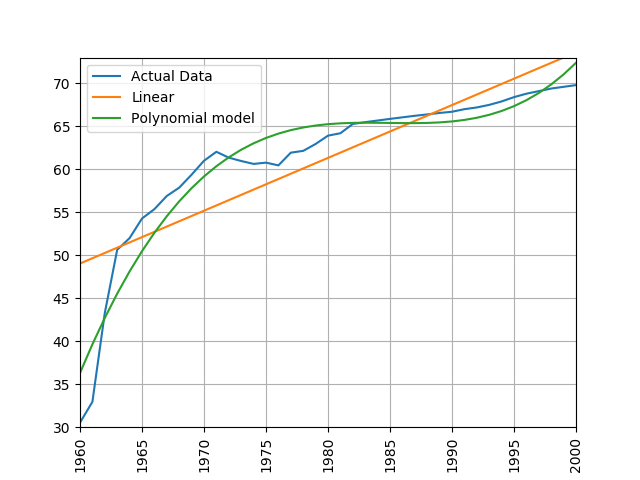
Next, let’s fit a polynomial regression model of life expectancy in the UK between the years 1950 and 1980. How many predictor variables are used to predict life expectancy in this model? What do you notice about the plot? What happens if you decrease the degree of the polynomial?
There are 6 predictor variables in a 5-degree polynomial: [1, x, x^2, x^3, x^4, x^5]. The model appears to fit the data quite well when a 5-degree polynomial is used. As we decrease the degree of the polynomial, the model fits the training data less precisely.
from regression_helper_functions import process_life_expectancy_data_poly

filepath = 'data/gapminder-life-expectancy.csv'
process_life_expectancy_data_poly(5, filepath,
                             "United Kingdom", [1950, 1980])
plt.show()
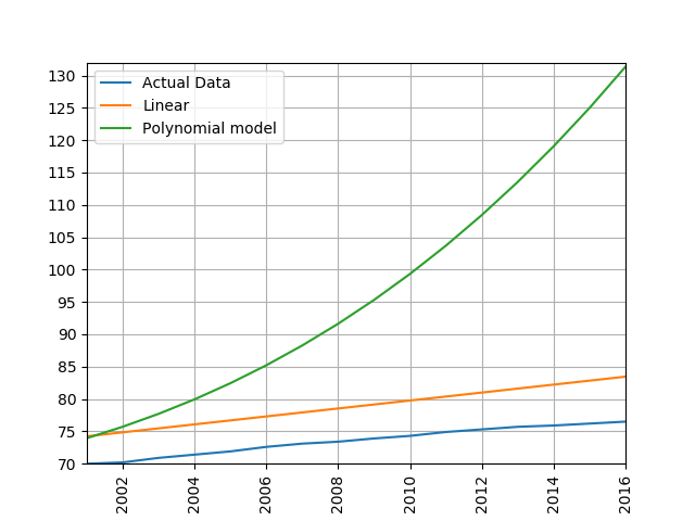
Now let’s modify our call to process_life_expectancy_data_poly() to report the model’s ability to generalize to future data (left out during the model fitting/training process). What is the model’s test set RMSE for the time-span 2005:2016?
filepath = 'data/gapminder-life-expectancy.csv'
process_life_expectancy_data_poly(5, filepath,
                             "United Kingdom", [1950, 1980],[2005,2016])
plt.show()
The test RMSE is very high! Sometimes a more complicated model isn’t always a better model in terms of the model’s ability to generalize to unseen data. When a model fits training data well but poorly generalized to test data, we call this overfitting.
Let’s compare the polynomial model with our standard linear model.
process_life_expectancy_data_poly(10, filepath,
                             "United Kingdom", [1950, 1980],[2005,2016])
process_life_expectancy_data_sklearn(filepath,
                             "United Kingdom", [1950, 1980],[2005,2016])
plt.show()
Exercise: Comparing linear and polynomial models
Train a linear and polynomial model on life expectancy data from China between 1960 and 2000. Then predict life expectancy from 2001 to 2016 using both methods. Compare their root mean squared errors, which is more accurate? Why do you think this model is the more accurate one?
Solution
modify the call to the process_life_expectancy_data
process_life_expectancy_data_poly("../data/gapminder-life-expectancy.csv", "China", 1960, 2000)linear prediction error is 5.385162846665607 polynomial prediction error is 28.169167771983528 The linear model is more accurate, polynomial models often become wildly inaccurate beyond the range they were trained on. Look at the predicted life expectancies, the polynomial model predicts a life expectancy of 131 by 2016!
Key Points
Clustering with Scikit Learn
Overview
Teaching: min
Exercises: minQuestions
Objectives
Clustering
Clustering is the grouping of data points which are similar to each other. It can be a powerful technique for identifying patterns in data. Clustering analysis does not usually require any training and is known as an unsupervised learning technique. The lack of a need for training means it can be applied quickly.
Applications of Clustering
- Looking for trends in data
- Data compression, all data clustering around a point can be reduced to just that point. For example, reducing colour depth of an image.
- Pattern recognition
K-means Clustering
The K-means clustering algorithm is a simple clustering algorithm that tries to identify the centre of each cluster. It does this by searching for a point which minimises the distance between the centre and all the points in the cluster. The algorithm needs to be told how many clusters to look for, but a common technique is to try different numbers of clusters and combine it with other tests to decide on the best combination.
K-means with Scikit Learn
For this example, we’re going to use scikit learn’s built in random data blob generator instead of using an external dataset. For this we’ll also need the sklearn.datasets.samples_generator module.
We can then create some random blobs using the make_blobs function. The n_samples argument sets how many points we want to use in all of our blobs. cluster_std sets the standard deviation of the points, the smaller this value the closer together they will be. centers sets how many clusters we’d like. random_state is the initial state of the random number generator, by specifying this we’ll get the same results every time we run the program. If we don’t specify a random state then we’ll get different points every time we run. This function returns two things, an array of data points and a list of which cluster each point belongs to.
import sklearn.datasets as skl_datasets
data, cluster_ids = skl_datasets.make_blobs(n_samples=800, cluster_std=0.5, centers=4, random_state=1)
Check the data’s shape and contents
import numpy as np
print(np.shape(data)) # x and y positions for 800 datapoints generated from 4 cluster centers
print(cluster_ids) # each datapoint belongs to 1 of 4 clusters. Each cluster has 100 datapoints
Plot the data
import matplotlib.pyplot as plt
plt.scatter(data[:, 0], data[:, 1], s=5, linewidth=0)
plt.show()
Now that we have some data we can go ahead and try to identify the clusters using K-means.
- To perform a k-means clustering with Scikit learn we first need to import the sklearn.cluster module.
- Then, we need to initialise the KMeans module and tell it how many clusters to look for.
- Next, we supply it some data via the fit function, in much the same we did with the regression functions earlier on.
- Finally, we run the predict function to find the clusters.
import sklearn.cluster as skl_cluster
Kmean = skl_cluster.KMeans(n_clusters=4, random_state=0)
Kmean.fit(data)
model_preds = Kmean.predict(data)
print(model_preds)
The data can now be plotted according to cluster assignment. To make it clearer which cluster points have been classified to we can set the colours (the c parameter) to use the clusters list that was returned
by the predict function. The Kmeans algorithm also lets us know where it identified the centre of each cluster as. These are stored as a list called cluster_centers_ inside the Kmean object. Let’s go ahead and plot the points from the clusters, colouring them by the output from the K-means algorithm, and also plot the centres of each cluster as a red X.
plt.scatter(data[:, 0], data[:, 1], s=5, linewidth=0, c=model_preds)
for cluster_x, cluster_y in Kmean.cluster_centers_:
    plt.scatter(cluster_x, cluster_y, s=100, c='r', marker='x')
Advantages of Kmeans
- Simple algorithm, fast to compute. A good choice as the first thing to try when attempting to cluster data.
- Suitable for large datasets due to its low memory and computing requirements.
Key limitation of K-Means by itself
- Requires number of clusters to be known in advance. In practice, we often don’t know the true number of clusters. How can we assess the quality of different clustering results?
import sklearn.cluster as skl_cluster
import sklearn.datasets as skl_datasets
import matplotlib.pyplot as plt

data, cluster_id = skl_datasets.make_blobs(n_samples=400, cluster_std=0.75, centers=4, random_state=1)

Kmean = skl_cluster.KMeans(n_clusters=4)
Kmean.fit(data)
clusters = Kmean.predict(data)

plt.scatter(data[:, 0], data[:, 1], s=5, linewidth=0, c=clusters)
for cluster_x, cluster_y in Kmean.cluster_centers_:
    plt.scatter(cluster_x, cluster_y, s=100, c='r', marker='x')
plt.show()
Working in multiple dimensions
Although this example shows two dimensions the kmeans algorithm can work in more than two, it just becomes very difficult to show this visually once we get beyond 3 dimensions. Its very common in machine learning to be working with multiple variables and so our classifiers are working in multi-dimensional spaces.
Limitations of K-Means
- Requires number of clusters to be known in advance
- Struggles when clusters have irregular shapes
- Will always produce an answer finding the required number of clusters even if the data isn’t clustered (or clustered in that many clusters).
- Requires linear cluster boundaries
Advantages of K-Means
- Simple algorithm, fast to compute. A good choice as the first thing to try when attempting to cluster data.
- Suitable for large datasets due to its low memory and computing requirements.
Cluster Quality Metrics
- Run below code and explain review the plots generated
- Review meas_plot_silhouette_scores() script noting sections to calculate silhouette score
from clustering_helper_functions import meas_plot_silhouette_scores
meas_plot_silhouette_scores(data, cluster_ids)
Exercise: Generate new blobs and review cluster quality
Using the make_blobs function, generate a new dataset containing four clusters and a cluster_std equal to 1. Can we still determine the correct number of clusters using the silhouette score? What happens if you increase the std even further (e.g., 3.5)?
Solution
data, cluster_ids = skl_datasets.make_blobs(n_samples=800, cluster_std=1, centers=4, random_state=1)
meas_plot_silhouette_scores(data, cluster_ids)
Wither a higher standard deviation, the silhouette score tells us to select N=2 as the number of clusters. When clustering real-world datasets, this is a common problem. Oftentimes, researchers have to come up with clever evaluation metrics that are customized for their research application (e.g., using background knowledge to determine the likely number of clusters, deciding if each cluster should be of a certain size, etc.). Alternatively, new features can be measured in hopes that those features will produce separable clusters. Sometimes, we have to accept the harsh reality that clustering may not be a viable option for our data or research questions.
Exercise: K-Means with overlapping clusters
Adjust the program above to increase the standard deviation of the blobs (the cluster_std parameter to make_blobs) and increase the number of samples (n_samples) to 4000. You should start to see the clusters overlapping. Do the clusters that are identified make sense? Is there any strange behaviour from this?
Solution
The resulting image from increasing n_samples to 4000 and cluster_std to 3.0 looks like this:
The straight line boundaries between clusters look a bit strange.
Exercise: How many clusters should we look for?
As K-Means requires us to specify the number of clusters to expect a common strategy to get around this is to vary the number of clusters we are looking for. Modify the program to loop through searching for between 2 and 10 clusters. Which (if any) of the results look more sensible? What criteria might you use to select the best one?
Solution
for cluster_count in range(2,11):
    Kmean = skl_cluster.KMeans(n_clusters=cluster_count)
    Kmean.fit(data)
    clusters = Kmean.predict(data)
    plt.scatter(data[:, 0], data[:, 1], s=5, linewidth=0,c=clusters)
    for cluster_x, cluster_y in Kmean.cluster_centers_:
        plt.scatter(cluster_x, cluster_y, s=100, c='r', marker='x')
        # give the graph a title with the number of clusters
        plt.title(str(cluster_count)+" Clusters")
    plt.show()
None of these look very sensible clusterings because all the points really form one large cluster. We might look at a measure of similarity of the cluster to test if its really multiple clusters. A simple standard deviation or interquartile range might be a good starting point.
Spectral Clustering
The key limitation of K-means is that it requires clusters be linearly separable. Not all data will take this form. Spectral clustering is a technique that attempts to overcome the linear boundary problem of k-means clustering. It works by treating clustering as a graph partitioning problem, its looking for nodes in a graph with a small distance between them. See this introduction to Spectral Clustering if you are interested in more details about how spectral clustering works.
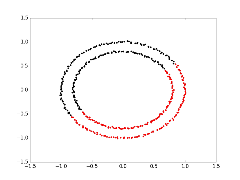
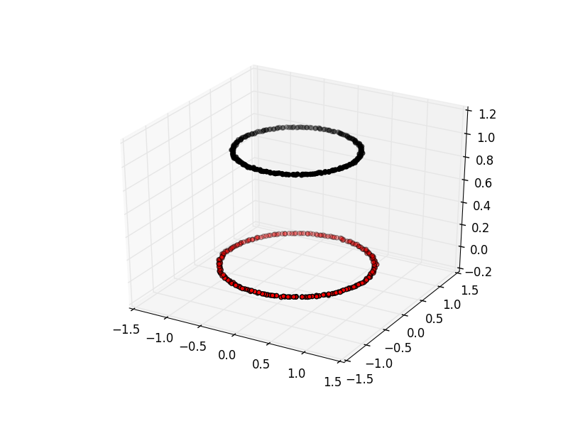
Here is an example of using spectral clustering on two concentric circles
Spectral clustering uses something called a kernel trick to introduce additional dimensions to the data. A common example of this is trying to cluster one circle within another (concentric circles). A K-means classifier will fail to do this and will end up effectively drawing a line which crosses the circles. Spectral clustering will introduce an additional dimension that effectively moves one of the circles away from the other in the additional dimension. This has the downside of being more computationally expensive than k-means clustering.
Spectral Clustering with Scikit Learn
Lets try out using Scikit Learn’s spectral clustering. To make the concentric circles in the above example we need to use the make_circles function in the sklearn.datasets module. This works in a very similar way to the make_blobs function we used earlier on.
# create two clusters; a larger circle surrounding a smaller circle in 2d.
circles, circles_clusters = skl_datasets.make_circles(n_samples=400, noise=.01, random_state=0)

# plot the data, colouring it by cluster
plt.scatter(circles[:, 0], circles[:, 1], s=15, linewidth=0.1, c=circles_clusters,cmap='flag')
plt.title('True Clusters')
plt.show()
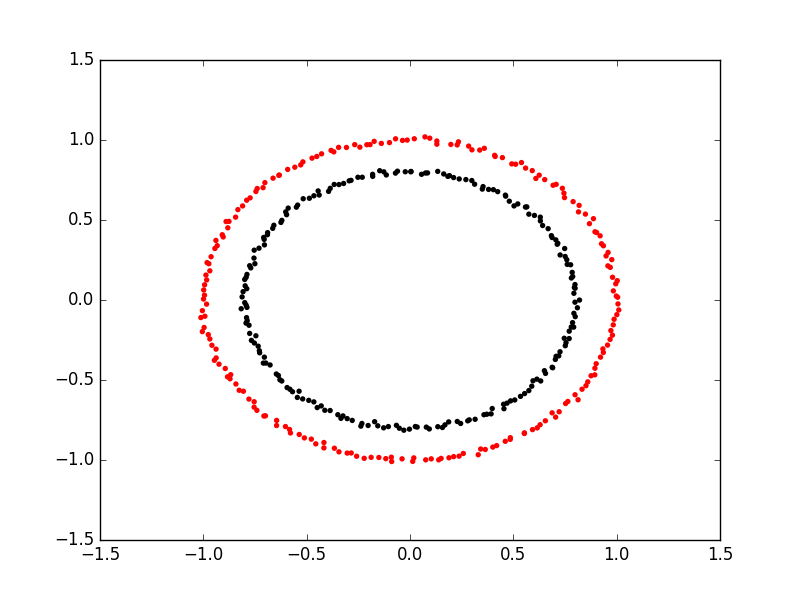
The code for calculating the SpectralClustering is very similar to the kmeans clustering, instead of using the sklearn.cluster.KMeans class we use the sklearn.cluster.SpectralClustering class.
model = skl_cluster.SpectralClustering(n_clusters=2, affinity='nearest_neighbors', assign_labels='kmeans')
The SpectralClustering class combines the fit and predict functions into a single function called fit_predict.
labels = model.fit_predict(circles)
plt.scatter(circles[:, 0], circles[:, 1], s=15, linewidth=0, c=labels, cmap='flag')
plt.title('Spectral Clustering')
plt.show()
Let’s see how KMeans compares on this dataset.
# cluster with kmeans
Kmean = skl_cluster.KMeans(n_clusters=2)
Kmean.fit(circles)
clusters = Kmean.predict(circles)

# plot the data, colouring it by cluster
plt.scatter(circles[:, 0], circles[:, 1], s=15, linewidth=0.1, c=clusters,cmap='flag')
plt.title('KMeans')
plt.show()
Runtime comparison of KMeans vs spectral clustering
from clustering_helper_functions import compare_KMeans_SpectralClustering
num_clusters = 4
data, cluster_ids = skl_datasets.make_blobs(n_samples=15000, cluster_std=1.5, centers=num_clusters, random_state=1)
compare_KMeans_SpectralClustering(data, cluster_ids, num_clusters)
Observe: spectral clustering becomes much slower for larger datasets. Its time complexity is O(n^3), where n is the number of input data points.
Comparing k-means and spectral clustering performance
Modify the program we wrote in the previous exercise to use spectral clustering instead of k-means, save it as a new file. Time how long both programs take to run. Add the line
import timeat the top of both files, as the first line in the file get the start time withstart_time = time.time(). End the program by getting the time again and subtracting the start time from it to get the total run time. Addend_time = time.time()andprint("Elapsed time:",end_time-start_time,"seconds")to the end of both files. Compare how long both programs take to run generating 4,000 samples and testing them for between 2 and 10 clusters. How much did your run times differ? How much do they differ if you increase the number of samples to 8,000? How long do you think it would take to compute 800,000 samples (estimate this, it might take a while to run for real)?Solution
KMeans version, runtime around 4 seconds (your computer might be faster/slower)
import matplotlib.pyplot as plt
import sklearn.cluster as skl_cluster
from sklearn.datasets import make_blobs
import time

start_time = time.time()
data, cluster_id = make_blobs(n_samples=4000, cluster_std=3,
                                       centers=4, random_state=1)

for cluster_count in range(2,11):
    Kmean = skl_cluster.KMeans(n_clusters=cluster_count)
    Kmean.fit(data)
    clusters = Kmean.predict(data)

    plt.scatter(data[:, 0], data[:, 1], s=15, linewidth=0, c=clusters)
    plt.title(str(cluster_count)+" Clusters")

plt.show()

end_time = time.time()
print("Elapsed time = ", end_time-start_time, "seconds")
Spectral version, runtime around 9 seconds (your computer might be faster/slower)
import matplotlib.pyplot as plt
import sklearn.cluster as skl_cluster
from sklearn.datasets import make_blobs
import time

start_time = time.time()
data, cluster_id = make_blobs(n_samples=4000, cluster_std=3,
                                       centers=4, random_state=1)

for cluster_count in range(2,11):
    model = skl_cluster.SpectralClustering(n_clusters=cluster_count,
                                       affinity='nearest_neighbors',
                                       assign_labels='kmeans')
    labels = model.fit_predict(data)

    plt.scatter(data[:, 0], data[:, 1], s=15, linewidth=0, c=labels)
    plt.title(str(cluster_count)+" Clusters")
plt.show()
end_time = time.time()
print("Elapsed time = ", end_time-start_time, "seconds")
When the number of points increases to 8000 the runtimes are 24 seconds for the spectral version and 5.6 seconds for kmeans. The runtime numbers will differ depending on the speed of your computer, but the relative different should be similar. For 4000 points kmeans took 4 seconds, spectral 9 seconds, 2.25 fold difference. For 8000 points kmeans took 5.6 seconds, spectral took 24 seconds. 4.28 fold difference. Kmeans 1.4 times slower for double the data, spectral 2.6 times slower. The realative difference is diverging. Its double by doubling the amount of data. If we use 100 times more data we might expect a 100 fold divergence in execution times. Kmeans might take a few minutes, spectral will take hours.
Key Points
Dimensionality Reduction
Overview
Teaching: min
Exercises: minQuestions
Objectives
Dimensionality Reduction
Dimensionality reduction techniques involve the selection or transformation of input features to create a more concise representation of the data, thus enabling the capture of essential patterns and variations while reducing noise and redundancy. They are applied to “high-dimensional” datasets, or data containing many features/predictors.
Dimensionality reduction techniques are useful in the context of machine learning problems for several reasons:
- Avoids overfitting effects: It can be difficult to find general trends in data when fitting a model to high-dimensional dataset. As the number of model coefficients begins to approach the number of observations used to train the model, we greatly increase our risk of simply memorizing the training data.
- Pattern discovery: They can reveal hidden patterns, clusters, or structures that might not be evident in the original high-dimensional space
- Data visualization: High-dimensional data can be challenging to visualize and interpret directly. Dimensionality reduction methods, such as Principal Component Analysis (PCA) or t-Distributed Stochastic Neighbor Embedding (t-SNE), project data onto a lower-dimensional space while preserving important patterns and relationships. This allows you to create 2D or 3D visualizations that can provide insights into the data’s structure.
The potential downsides of using dimensionality reduction techniques include:
- Oversimplifications: When we reduce dimensionality of our data, we are removing some information from the data. The goal is to remove only noise or uninteresting patterns of variation. If we remove too much, we may remove signal from the data and miss important/interesting relationships.
- Complexity and parameter tuning: Some dimensionality reduction techniques, such as t-SNE or autoencoders, can be complex to implement and require careful parameter tuning. Selecting the right parameters can be challenging and may not always lead to optimal results.
- Interpretability: Reduced-dimensional representations may be less interpretable than the original features. Understanding the meaning or significance of the new components or dimensions can be challenging, especially when dealing with complex models like neural networks.
Dimensionality Reduction with Scikit-learn
First setup our environment and load the MNIST digits dataset which will be used as our initial example.
from sklearn import datasets

digits = datasets.load_digits()

# Examine the dataset
print(digits.data)
print(digits.target)

X = digits.data
y = digits.target
Check data type of X and y.
print(type(X))
print(type(y))
<class 'numpy.ndarray'>
<class 'numpy.ndarray'>
The range of pixel values in this dataset is between 0 and 16, representing different shades of gray
print(X.min())
X.max()
Check shape of X and y.
import numpy as np
print(np.shape(X)) # 1797 observations, 64 features/pixels
print(np.shape(y))
(1797, 64)
(1797,)
# create a quick histogram to show number of observations per class
import matplotlib.pyplot as plt
plt.hist(y)
plt.ylabel('Count')
plt.xlabel('Digit')
plt.show()
Preview the data
# Number of digits to plot
digits_to_plot = 10

# Number of versions of each digit to plot
n_versions = 3

# Create a figure with subplots
fig, axs = plt.subplots(n_versions, digits_to_plot, figsize=(12, 6))

# Loop through a small sample of digits and plot their raw images
for digit_idx in range(digits_to_plot):
    # Find up to n_versions occurrences of the current digit in the dataset
    indices = np.where(y == digit_idx)[0][:n_versions]

    for version_idx, index in enumerate(indices):
        # Reshape the 1D data into a 2D array (8x8 image)
        digit_image = X[index].reshape(8, 8)

        # Plot the raw image of the digit in the corresponding subplot
        axs[version_idx, digit_idx].imshow(digit_image, cmap='gray')
        axs[version_idx, digit_idx].set_title(f"Digit {digit_idx}")
        axs[version_idx, digit_idx].axis('off')

plt.tight_layout()
plt.show()
Calculate the percentage of variance accounted for by each variable in this dataset.
var_per_feat = np.var(X,0) # variance of each feature
sum_var = np.sum(var_per_feat) # total variability summed across all features
var_ratio_per_feat = var_per_feat/sum_var #
sum(var_ratio_per_feat) # should sum to 1.0
Sort the variance ratios in descending order
sorted_var_ratio_per_feat = np.sort(var_ratio_per_feat)[::-1]
sorted_var_ratio_per_feat*100
Plot the cumulative variance ratios ordered from largest to smallest
cumulative_var_ratio = np.cumsum(sorted_var_ratio_per_feat) * 100

# Plot the cumulative variance ratios ordered from largest to smallest
plt.plot(cumulative_var_ratio)
plt.xlabel("Pixel (Ordered by Variance)")
plt.ylabel("Cumulative % of Total Variance")
plt.title("Cumulative Explained Variance vs. Pixel ID (Ordered by Variance)")
plt.grid(True)
plt.show()
This data has 64 pixels or features that can be fed into a model to predict digit classes. Features or pixels with more variability will often be more predictive of the target class because those pixels will tend to vary more with digit assignments. Unfortunately, each pixel/feature contributes just a small percentage of the total variance found in this dataset. This means that a machine learning model will likley require many training examples to learn how the features interact to predict a specific digit.
Train/test split
Perform a train/test split in preparation of training a classifier. We will artificially decrease our amount of training data such that we are modeling in a high-dimensional context (where number of observations approaches number of predictors)
from sklearn.model_selection import train_test_split
# Split the dataset into training and test sets
test_size = .98
X_train, X_test, y_train, y_test = train_test_split(X, y, test_size=test_size, random_state=42, stratify=y)
print(X_train.shape)
Train a classifier
Train a classifier. Here, we will use something called a multilayer perceptron (MLP) which is a type of artificial neural network. We’ll dive more into the details behind this model in the next episode. For now, just know that this model has thousands of coefficients/weights that must be estimated from the data. The total number of coefs is calculated below.
n_features = X_train.shape[1]
hidden_layer1_neurons = 64
hidden_layer2_neurons = 64
n_output_neurons = 10
total_coefficients = n_features * (hidden_layer1_neurons + 1) * (hidden_layer2_neurons + 1) * n_output_neurons
total_coefficients
from sklearn.neural_network import MLPClassifier
from sklearn.metrics import accuracy_score, confusion_matrix
import seaborn as sns

def train_and_evaluate_mlp(X_train, X_test, y_train, y_test):
    # Create an MLP classifier
    mlp = MLPClassifier(hidden_layer_sizes=(64, 64), max_iter=5000, random_state=42)

    # Fit the MLP model to the training data
    mlp.fit(X_train, y_train)

    # Make predictions on the training and test sets
    y_train_pred = mlp.predict(X_train)
    y_test_pred = mlp.predict(X_test)

    # Calculate the accuracy on the training and test sets
    train_accuracy = accuracy_score(y_train, y_train_pred)
    test_accuracy = accuracy_score(y_test, y_test_pred)

    print(f"Training Accuracy: {train_accuracy:.2f}")
    print(f"Test Accuracy: {test_accuracy:.2f}")

    # Calculate and plot the confusion matrix
    cm = confusion_matrix(y_test, y_test_pred)
    plt.figure(figsize=(8, 6))
    sns.heatmap(cm, annot=True, fmt='d', cmap='Blues', cbar=False)
    plt.xlabel('Predicted')
    plt.ylabel('True')
    plt.title('Confusion Matrix')
    plt.show()

    return train_accuracy, test_accuracy

train_and_evaluate_mlp(X_train, X_test, y_train, y_test);
Principle Component Analysis (PCA)
PCA is a data transformation technique that allows you to represent variance across variables more efficiently. Specifically, PCA does rotations of data matrix (N observations x C features) in a two dimensional array to decompose the array into vectors that are orthogonal and can be ordered according to the amount of information/variance they carry. After transforming the data with PCA, each new variable (or pricipal component) can be thought of as a linear combination of several of the original variables.
1. PCA, at its core, is a data transformation technique
2. Allows us to more efficiently represent the variability present in the data
3. It does this by linearly combining variables into new variables called principal component scores
4. The new transformed variables are all "orthogonal" to one another, meaning there is no redundancy or correlation between variables.
Use the below code to run PCA on the MNIST dataset. This code will also plot the percentage of variance explained by each principal component in the transformed dataset. Note how the percentage of variance explained is quite high for the first 10 or so principal components. Compare this plot with the one we made previously.
from sklearn.decomposition import PCA

# Create a PCA instance
pca = PCA()

pca.fit(X)  # in-place operation that stores the new basis dimensions (principal components) that will be used to transform X

# Calculate the cumulative sum of explained variance ratios
explained_variance_ratio_cumsum = pca.explained_variance_ratio_.cumsum() * 100

# Plot the cumulative explained variance ratio
plt.plot(explained_variance_ratio_cumsum, marker='o', linestyle='-')
plt.xlabel("Number of Principal Components")
plt.ylabel("Cumulative Explained Variance (%)")
plt.title("Cumulative Explained Variance vs. Number of Principal Components")
plt.grid(True)
plt.show()
How many principal components (dimensions) should we keep?
Our data is now more compactly/efficiently represented. We can now try to re-classify our data using a smaller number of principal components.
When making this decision, it’s important to take into consideration how much of the total variability is represented the number of principal components you choose to keep. A few common approaches/considerations include:
- Keeping as many as are needed to reach some reasonably high variance threshold (e.g., 50-99%). This method ensures you don’t remove any important signal from the data.
- Look for the inflection point in the cumulative variance plot where the slope drops off significantly (sometimes called the “elbow” or “scree” method)
- Use data-driven methods to assess overfitting effects with different numbers of components. In a high-dimensional context, tossing out a little information can yield much better model performance.
var_thresh = 50
n_components = np.argmax(explained_variance_ratio_cumsum >= var_thresh) + 1
n_components
Transform X and keep just the first n_components new variables known as “PCA scores”, though often sloppily referred to as principal components.
X_pca = pca.transform(X) # transform X
X_pca = X_pca[:, :n_components]
X_pca.shape
We can plot the data for the first two pricipal directions of variation — color coded according to digit class. Notice how the data separates rather nicely into different clusters representative of different digits.
# PCA
pca = decomposition.PCA(n_components=2)
pca.fit(X)
X_pca = pca.transform(X)

fig = plt.figure(1, figsize=(4, 4))
plt.clf()
plt.scatter(X_pca[:, 0], X_pca[:, 1], c=y, cmap=plt.cm.nipy_spectral,
        edgecolor='k',label=y)
plt.colorbar(boundaries=np.arange(11)-0.5).set_ticks(np.arange(10))
plt.savefig("pca.svg")

Plot in 3D instead
from mpl_toolkits.mplot3d import Axes3D
fig = plt.figure(1, figsize=(4, 4))
ax = fig.add_subplot(projection='3d')
ax.scatter(X_pca[:, 0], X_pca[:, 1], X_pca[:, 2], c=y,
          cmap=plt.cm.nipy_spectral, s=9, lw=0);
Repeat classification task
PCA and Modeling
In general (with some notable exceptions), as you increase the number of predictor variables used by a model, additional data is needed to fit a good model (i.e., one that doesn’t overfit the training data). Overfitting refers to when a model fits the training data too well, resulting in a model that fails to generalize to unseen test data.
A common solution to overfitting is to simply collect more data. However, data can be expensive to collect and label. When additional data isn’t an option, a good choice is often dimensionality reduction techniques.
Let’s see how much better our classifier can do when using PCA to reduce dimensionality.
X_train_pca, X_test_pca, y_train_pca, y_test_pca = train_test_split(X_pca, y, test_size=test_size, random_state=42)
X_train_pca.shape
train_and_evaluate_mlp(X_train_pca, X_test_pca, y_train_pca, y_test_pca)
Exploring different variance thresholds
Run the for loop below to experiment with different variance thresholds.
What do you notice about the result? Which variance threshold works best for this data?
var_thresh_list = [10, 20, 50, 60, 75, 90, 100]
print(var_thresh_list)
for var_thresh in var_thresh_list:
    print(f'var_thresh = {var_thresh}%')
    n_components = np.argmax(explained_variance_ratio_cumsum >= var_thresh) + 1
    print(f'n_components = {n_components}')
    X_pca = pca.transform(X) # transform X
    X_pca = X_pca[:, :n_components]
    X_train_pca, X_test_pca, y_train_pca, y_test_pca = train_test_split(X_pca, y, test_size=test_size, random_state=42)
    train_accuracy, test_accuracy = train_and_evaluate_mlp(X_train_pca, X_test_pca, y_train_pca, y_test_pca)
PCA when more data is available
Scroll to where we originally set the test_size variable in this episode (near the beginning). Adjust this value to 0.1. How does this change affect model performance with and without PCA?
t-distributed Stochastic Neighbor Embedding (t-SNE)
The t-SNE algorithm is a nonlinear dimensionality reduction technique. It is primarily used for visualizing high-dimensional data in lower-dimensional space.
# t-SNE embedding
tsne = manifold.TSNE(n_components=2, init='pca',
        random_state = 0)
X_tsne = tsne.fit_transform(X)
fig = plt.figure(1, figsize=(4, 4))
plt.clf()
plt.scatter(X_tsne[:, 0], X_tsne[:, 1], c=y, cmap=plt.cm.nipy_spectral,
        edgecolor='k',label=y)
plt.colorbar(boundaries=np.arange(11)-0.5).set_ticks(np.arange(10))
plt.savefig("tsne.svg")

Experimenting with the perpexlity hyperparameter. Default value is 30.
Low Perplexity: When you set a low perplexity value, t-SNE prioritizes preserving local structure, and data points that are close to each other in the high-dimensional space will tend to remain close in the low-dimensional embedding. This can reveal fine-grained patterns and clusters in the data.
High Perplexity: On the other hand, a high perplexity value places more emphasis on preserving global structure. It allows data points that are farther apart in the high-dimensional space to influence each other in the low-dimensional embedding. This can help uncover broader, more global patterns and relationships.
# List of perplexity values to visualize
perplexities = [5, 30, 50, 100]

# Create subplots
fig, axes = plt.subplots(2, 2, figsize=(10, 10))
fig.subplots_adjust(wspace=0.5, hspace=0.5)

for i, perplexity in enumerate(perplexities):
    # t-SNE embedding
    tsne = manifold.TSNE(n_components=2, init='pca', random_state=0, perplexity=perplexity)
    X_tsne = tsne.fit_transform(X)

    # Plot in the corresponding subplot
    ax = axes[i // 2, i % 2]
    scatter = ax.scatter(X_tsne[:, 0], X_tsne[:, 1], c=y, cmap=plt.cm.nipy_spectral, edgecolor='k', label=y)
    ax.set_title(f'Perplexity = {perplexity}')

    # Create a colorbar for the scatter plot
    cbar = fig.colorbar(scatter, ax=ax, boundaries=np.arange(11) - 0.5)
    cbar.set_ticks(np.arange(10))

plt.tight_layout()
plt.show()
Exercise: Working in three dimensions
The above example has considered only two dimensions since humans can visualize two dimensions very well. However, there can be cases where a dataset requires more than two dimensions to be appropriately decomposed. Modify the above programs to use three dimensions and create appropriate plots. Do three dimensions allow one to better distinguish between the digits?
Solution
from mpl_toolkits.mplot3d import Axes3D
# PCA
pca = decomposition.PCA(n_components=3)
pca.fit(X)
X_pca = pca.transform(X)
fig = plt.figure(1, figsize=(4, 4))
plt.clf()
ax = fig.add_subplot(projection='3d')
ax.scatter(X_pca[:, 0], X_pca[:, 1], X_pca[:, 2], c=y,
          cmap=plt.cm.nipy_spectral, s=9, lw=0)
plt.savefig("pca_3d.svg")
# t-SNE embedding
tsne = manifold.TSNE(n_components=3, init='pca',
        random_state = 0)
X_tsne = tsne.fit_transform(X)
fig = plt.figure(1, figsize=(4, 4))
plt.clf()
ax = fig.add_subplot(projection='3d')
ax.scatter(X_tsne[:, 0], X_tsne[:, 1], X_tsne[:, 2], c=y,
          cmap=plt.cm.nipy_spectral, s=9, lw=0)
plt.savefig("tsne_3d.svg")


Exercise: Parameters
Look up parameters that can be changed in PCA and t-SNE, and experiment with these. How do they change your resulting plots? Might the choice of parameters lead you to make different conclusions about your data?
Exercise: Other Algorithms
There are other algorithms that can be used for doing dimensionality reduction, for example the Higher Order Singular Value Decomposition (HOSVD) Do an internet search for some of these and examine the example data that they are used on. Are there cases where they do poorly? What level of care might you need to use before applying such methods for automation in critical scenarios? What about for interactive data exploration?
Key Points
Neural Networks
Overview
Teaching: min
Exercises: minQuestions
Objectives
Introduction
Neural networks are a machine learning method inspired by how the human brain works. They are particularly good at doing pattern recognition and classification tasks, often using images as inputs. They are a well-established machine learning technique that has been around since the 1950s but have gone through several iterations since that have overcome fundamental limitations of the previous one. The current state-of-the-art neural networks is often referred to as deep learning.
Perceptrons
Perceptrons are the building blocks of neural networks. They are an artificial version of a single neuron in the brain. They typically have one or more inputs and a single output. Each input will be multiplied by a weight and the value of all the weighted inputs are then summed together. Finally, the summed value is put through an activation function which decides if the neuron “fires” a signal. In some cases, this activation function is simply a threshold step function which outputs zero below a certain input and one above it. Other designs of neurons use other activation functions, but typically they have an output between zero and one and are still step-like in their nature.

Coding a perceptron
Below is an example of a perceptron written as a Python function. The function takes three parameters: Inputs is a list of input values, Weights is a list of weight values and Threshold is the activation threshold.
First let us multiply each input by the corresponding weight. To do this quickly and concisely, we will use the numpy multiply function which can multiply each item in a list by a corresponding item in another list.
We then take the sum of all the inputs multiplied by their weights. Finally, if this value is less than the activation threshold, we output zero, otherwise we output a one.
import numpy as np
def perceptron(inputs, weights, threshold):

    assert len(inputs) == len(weights)

    # multiply the inputs and weights
    values = np.multiply(inputs,weights)

    # sum the results
    total = sum(values)

    # decide if we should activate the perceptron
    if total < threshold:
        return 0
    else:
        return 1
Computing with a perceptron
A single perceptron can perform basic linear classification problems such as computing the logical AND, OR, and NOT functions.
OR
| Input 1 | Input 2 | Output |
|---|---|---|
| 0 | 0 | 0 |
| 0 | 1 | 1 |
| 1 | 0 | 1 |
| 1 | 1 | 1 |
AND
| Input 1 | Input 2 | Output |
|---|---|---|
| 0 | 0 | 0 |
| 0 | 1 | 0 |
| 1 | 0 | 0 |
| 1 | 1 | 1 |
NOT
| Input 1 | Output |
|---|---|
| 0 | 1 |
| 1 | 0 |
We can get a single perceptron to compute each of these functions
OR:
inputs = [[0.0,0.0],[1.0,0.0],[0.0,1.0],[1.0,1.0]]
for input in inputs:
    print(input,perceptron(input, [0.5,0.5], 0.5))
AND:
inputs = [[0.0,0.0],[1.0,0.0],[0.0,1.0],[1.0,1.0]]
for input in inputs:
    print(input,perceptron(input, [0.5,0.5], 1.0))
NOT:
The NOT function only has a single input but to make it work in the perceptron, we need to introduce a bias term which is always the same value. In this example, it is the second input. It has a weight of 1.0, the weight on the real input is -1.0.
inputs = [[0.0,1.0],[1.0,1.0]]
for input in inputs:
    print(input,perceptron(input, [-1.0,1.0], 1.0))
A perceptron can be trained to compute any function which has linear separability. A simple training algorithm called the perceptron learning algorithm can be used to do this and scikit-learn has its own implementation of it. We are going to skip over the perceptron learning algorithm and move straight onto more powerful techniques. If you want to learn more about it see this page from Dublin City University.
Perceptron limitations
A single perceptron cannot solve any function that is not linearly separable, meaning that we need to be able to divide the classes of inputs and outputs with a straight line. A common example of this is the XOR function shown below:
| Input 1 | Input 2 | Output |
|---|---|---|
| 0 | 0 | 0 |
| 0 | 1 | 1 |
| 1 | 0 | 1 |
| 1 | 1 | 0 |
(Make a graph of this)
This function outputs a zero both when all its inputs are one or zero and its not possible to separate with a straight line. This is known as linear separability, when this limitation was discovered in the 1960s it effectively halted development of neural networks for over a decade in a period known as the “AI Winter”.
Multi-layer Perceptrons
A single perceptron cannot be used to solve a non-linearly separable function. For that, we need to use multiple perceptrons and typically multiple layers of perceptrons. They are formed of networks of artificial neurons which each take one or more inputs and typically have a single output. The neurons are connected together in large networks typically of 10s to 1000s of neurons. Typically, networks are connected in layers with an input layer, middle or hidden layer (or layers) and finally an output layer.

Training Multi-layer perceptrons
Multi-layer perceptrons need to be trained by showing them a set of training data and measuring the error between the network’s predicted output and the true value. Training takes an iterative approach that improves the network a little each time a new training example is presented. There are a number of training algorithms available for a neural network today, but we are going to use one of the best established and well known, the backpropagation algorithm. The algorithm is called back propagation because it takes the error calculated between an output of the network and the true value and takes it back through the network to update the weights. If you want to read more about back propagation, please see this chapter from the book “Neural Networks - A Systematic Introduction”.
Multi-layer perceptrons in scikit-learn
We are going to build a multi-layer perceptron for recognising handwriting from images. Scikit Learn includes some example handwriting data from the MNIST data set, this consists of 70,000 images of hand written digits. Each image is 28x28 pixels in size (784 pixels in total) and is represented in grayscale with values between zero for fully black and 255 for fully white. This means we will need 784 perceptrons in our input layer, each taking the input of one pixel and 10 perceptrons in our output layer to represent each digit we might classify. If trained correctly then only the perceptron in the output layer to “fire” will be on the one representing the in the image (this is a massive oversimplification!).
We can import this dataset from sklearn.datasets with then load it into memory by calling the fetch_openml function.
import sklearn.datasets as skl_data
data, labels = skl_data.fetch_openml('mnist_784', version=1, return_X_y=True)
This creates two arrays of data, one called data which contains the image data and the other labels that contains the labels for those images which will tell us which digit is in the image. A common convention is to call the data X and the labels y
print(data.shape)
data.head()
As neural networks typically want to work with data that ranges between 0 and 1.0 we need to normalise our data to this range. Python has a shortcut which lets us divide the entire data array by 255 and store the result, we can simply do:
data = data / 255.0
Let us take 90% of the data for training and 10% for testing, so we will use the first 63,000 samples in the dataset as the training data and the last 7,000 as the test data. We can split these using a slice operator.
from sklearn.model_selection import train_test_split

X_train, X_test, y_train, y_test = train_test_split(data, labels, test_size=.10, random_state=42, stratify=labels)
print(X_train.shape)
print(X_test.shape)
Now we need to initialise a neural network, scikit learn has an entire library sklearn.neural_network for this and the MLPClassifier class handles multi-layer perceptrons. This network takes a few parameters including the size of the hidden layer, the maximum number of training iterations we’re going to allow, the exact algorithm to use, if we’d like verbose output about what the training is doing and the initial state of the random number generator.
In this example we specify a multi-layer perceptron with 50 hidden nodes, we allow a maximum of 50 iterations to train it, we turn on verbose output to see what’s happening and initialise the random state to 1 so that we always get the same behaviour.
Now let us go ahead and train the network. This line will take about one minute to run. We do this by calling the fit function inside the mlp class instance. This needs two arguments the data itself and the labels showing what class each item should be classified to.
import sklearn.neural_network as skl_nn
mlp = skl_nn.MLPClassifier(hidden_layer_sizes=(50), max_iter=50, verbose=1, random_state=1)
mlp.fit(X_train,y_train)
Finally, let us score the accuracy of our network against both the original training data and the test data. If the training had converged to the point where each iteration of training was not improving the accuracy, then the accuracy of the training data should be 1.0 (100%). In scikit-learn, the score method for classifiers like MLPClassifier returns the accuracy of the classifier on the given test data and labels. Specifically, it computes the accuracy, which is the ratio of correctly classified samples to the total number of samples in the test dataset.
print("Training set score", mlp.score(X_train, y_train))
print("Testing set score", mlp.score(X_test, y_test))
Prediction using a multi-layer perceptron
Now that we have trained a multi-layer perceptron, we can give it some input data and ask it to perform a prediction. In this case, our input data is a 28x28 pixel image, which can also be represented as a 784-element list of data. The output will be a number between 0 and 9 telling us which digit the network thinks we have supplied. The predict function in the MLPClassifier class can be used to make a prediction. Let us try using the first digit from our test set as an example.
Before we can pass it to the predictor, we have to extract one of the digits from the test set. We can use iloc on the dataframe to get hold of the first element in the test set. In order to present it to the predictor, we have to turn it into a numpy array which has the dimensions of 1x784 instead of 28x28. We can then call the predict function with this array as our parameter. This will return an array of predictions (as it could have been given multiple inputs), the first element of this will be the predicted digit. You may get a warning stating “X does not have valid feature names”, this is because we didn’t encode feature names into our X (digit images) data. We can now verify if the prediction is correct by looking at the corresponding item in the y_test array.
index = 0
test_digit = X_test.iloc[index].to_numpy().reshape(1,784)
test_digit_prediciton = mlp.predict(test_digit)[0]
print("Predicted value",test_digit_prediciton)
print("Actual value",y_test.iloc[index])
This should be the same value which is being predicted.
Measuring Neural Network performance
We have now trained a neural network and tested prediction on a few images. This might have given us a feel for how well our network is performing, but it would be much more useful to have a more objective measure. Since recognising digits is a classification problem, we can measure how many predictions were correct in a set of test data. As we already have a test set of data with 7,000 images let us use that and see how many predictions the neural network has got right. We will loop through every image in the test set, run it through our predictor and compare the result with the label for that image. We will also keep a tally of how many images we got right and see what percentage were correct.
Confusion Matrix
From earlier, know what percentage of images were correctly classified, but we don’t know anything about the distribution of that across our different classes (the digits 0 to 9 in this case). A more powerful technique is known as a confusion matrix. Here we draw a grid with each class along both the x and y axis. The x axis is the actual number of items in each class and the y axis is the predicted number. In a perfect classifier there will be a diagonal line of values across the grid moving from the top left to bottom right corresponding to the number in each class and all other cells will be zero. If any cell outside of the diagonal is non-zero then it indicates a miss-classification. Scikit Learn has a function called confusion_matrix in the sklearn.metrics class which can display a confusion matrix for us. It will need two inputs, an array showing how many items were in each class for both the real data and the classifications. We already have the real data in the labels_test array, but we need to build it for the classifications by classifying each image (in the same order as the real data) and storing the result in another array.
from sklearn.metrics import confusion_matrix
import seaborn as sns

preds = []

for image in X_test.iterrows():
    # image contains a tuple of the row number and image data
    image = image[1].to_numpy().reshape(1,784)
    preds.append(mlp.predict(image)[0])

cm = confusion_matrix(y_test,preds)
plt.figure(figsize=(8, 6))
sns.heatmap(cm, annot=True, fmt='d', cmap='Blues', cbar=False)
plt.xlabel('Predicted')
plt.ylabel('True')
plt.title('Confusion Matrix')
plt.show()
Changing the learning rate hyperparameter
There are several hyperparameters which control the training of the data. One of these is called the learning rate, increasing this can reduce how many learning iterations we need. But make it too large and we will end up overshooting. Try tweaking this parameter by adding the parameter learning_rate_init, the default value of this is 0.001. Try increasing it to around 0.1.
mlp2 = skl_nn.MLPClassifier(hidden_layer_sizes=(50), max_iter=50, verbose=1, random_state=1, learning_rate_init=0.1)

mlp2.fit(X_train,y_train)

print("Training set score", mlp2.score(X_train, y_train))
print("Testing set score", mlp2.score(X_test, y_test))
Using cross-validation to determing optimal hyperparameter value.
Here, we use a train/test/validation split in order to assess how different values of the learning rate hyperparameter impact model performance.
The K-fold cross-validation procedure works as follows. We first split our data into training and test sets as usual. Then, or each possible value of the hyperparameter being tested…
- We take our training data and split it into K equal-sized subsets (called folds).
- We use K-1 of the folds for training the model, and the remaining fold for assessing the model’s performance after training. This remaining fold is known as the validation set.
- We repeat step 2 for each possible validation set (K total) and their associated training sets (the folds that were not left out)
After completing these steps, we can look at how the validation error varies with different values of the hyperparameter. We select the hyperparameter value / model that has the lowest validation error.
Finally, we train a model using all of the training data and hyperparameter value that was selected. Afterwards, we get a final assessment of the model’s generalizeability by measuring its error on the test set. It is critical that the test set is not involved in the model selection process — otherwise you risk being overly optimistic about your model’s ability to generalize.
from sklearn.model_selection import train_test_split, cross_val_score
from sklearn.neural_network import MLPClassifier
import numpy as np

# Load your dataset and labels here (e.g., data and labels are loaded into X and y)

# Split the data into train and test sets
X_train, X_test, y_train, y_test = train_test_split(data, labels, test_size=.10, random_state=42, stratify=labels)

# Define a range of learning rate values to explore
learning_rates = [0.001, 0.01, 0.1]

# Initialize a dictionary to store cross-validation results
cv_results = {}

# Perform 4-fold cross-validation for each learning rate
for learning_rate in learning_rates:
    mlp = MLPClassifier(hidden_layer_sizes=(100, 100), max_iter=3, learning_rate_init=learning_rate, random_state=42)
    scores = cross_val_score(mlp, X_train, y_train, cv=2, scoring='accuracy')
    cv_results[learning_rate] = scores.mean()

# Find the optimal learning rate based on cross-validation results
optimal_learning_rate = max(cv_results, key=cv_results.get)
optimal_score = cv_results[optimal_learning_rate]

print("Optimal Learning Rate:", optimal_learning_rate)
print("Optimal Cross-Validation Score:", optimal_score)

# Train the final model using the optimal learning rate on the combined train + validation set
final_X_train = np.vstack((X_train, X_validation))
final_y_train = np.hstack((y_train, y_validation))

final_model = MLPClassifier(hidden_layer_sizes=(100, 100), max_iter=1000, learning_rate_init=optimal_learning_rate, random_state=42)
final_model.fit(final_X_train, final_y_train)

# Assess the model on the held-out test set
test_score = final_model.score(X_test, y_test)
print("Test Set Score (Generalization Performance):", test_score)
Optimizing multiple hyperparameters
If you want to optimize multiple hyperparameters at once, look into sklearn’s GridSearchCV function. This will allow you to perform cross-validation across many hyperparameters at once. However, be careful not to go overboard in selecting too many possible hyperparameter combinations (esp. with complex models that take a while to train). It is typically better to investigate just a small subset of possible hyperparameter values so that you can find a good model (maybe not necessarily the BEST, but good enough) before the sun explodes.
Deep Learning
Deep learning usually refers to newer neural network architectures which use a special type of network known as a convolutional network. Typically, these have many layers and thousands of neurons. They are very good at tasks such as image recognition but take a long time to train and run. They are often used with GPU (Graphical Processing Units) which are good at executing multiple operations simultaneously. It is very common to use cloud computing or HPC systems with multiple GPUs attached.
Scikit learn is not really setup for Deep Learning. We will have to rely on other libraries. Common choices include Google’s TensorFlow, Keras, (Py)Torch or Darknet. There is however an interface layer between sklearn and tensorflow called skflow. A short example of doing this can be found at https://www.kdnuggets.com/2016/02/scikit-flow-easy-deep-learning-tensorflow-scikit-learn.html.
Cloud APIs
Google, Microsoft, Amazon, and many others now have Cloud based Application Programming Interfaces (APIs) where you can upload an image and have them return you the result. Most of these services rely on a large pre-trained (and often proprietary) neural network.
Exercise: Try cloud image classification
Take a photo with your phone camera or find an image online of a common daily scene. Upload it Google’s Vision AI example at https://cloud.google.com/vision/ How many objects has it correctly classified? How many did it incorrectly classify? Try the same image with Microsoft’s Computer Vision API at https://azure.microsoft.com/en-gb/services/cognitive-services/computer-vision/ Does it do any better/worse than Google?
Key Points
Ethics and Implications of Machine Learning
Overview
Teaching: min
Exercises: minQuestions
Objectives
Ethics and Machine Learning
There are increasing worries about the ethics of using machine learning. In recent year’s we’ve seen a number of worrying problems from machine learning entering all kinds of aspects of daily life and the economy:
- The first death from an autonomous car which failed to brake for a pedestrian.[1]
- Highly targetted advertising based around social media and internet usage. [2]
- The outcomes of elections and referendums being influenced by highly targetted social media posts . This is compunded by the data being obtained without the users’s consent. [3]
- The mass deploymeny of facial recognition technologies. [4]
- The possible first use of autonomous military robots making a decision to kill in battle. [5]
Problems with bias
Machine learning systems are often presented as more impartial and consistent ways to make decisions. For example sentencing criminals or deciding if somebody should be granted bail. There have been a number of examples recently where machine learning systems have been shown to be biased because the data they were trained on was already biased. This can occur due to the training data being unrepresentative and under representing certain groups. For example if you were trying to automatically screen job candidates and used a sample of people the same company had previously decided to employ then any biases in their past employment processes would be reflected in the machine learning.
Problems with explaining decisions
Many machine learning systems (e.g. neural networks) can’t really explain their decisions. Although the input and output are known trying to explain why the training caused the network to behave in a certain way can be very difficult. If a decision is questioned by a human its difficult to provide any rationale as to how a decision was arrived at.
Problems with accuracy
No machine learning system is ever 100% accurate. Getting into the high 90s is usually considered good. But when we’re evaluating millions of data items this can translate into 100s of thousands of mis-identifications. If the implications of these incorrect decisions are serious then it will cause major problems. For instance if it results in somebody being imprisoned or even investigated for a crime or maybe just being denied insurance or a credit card.
Energy Usage
Many machine learning systems (especially deep learning) need vast amounts of computational power which in turn can consume vast amounts of energy. Depending on the source of that energy this might account for significant amounts of fossil fuels being burned. It is not uncommon for a modern GPU accelerated computer to use several kilowatts of power, running this for one hour could easily use as much energy a typical home would use in an entire day. This can be particularly bad when models are constantly being retrained or when “parameter sweeps” are done to find the best set of parameters to train with.
Ethics of machine learning in research
Not all research using machine learning will have major ethical implications. Many research projects don’t directly affect the lives of other people, but this isn’t always the case.
Some questions you might want to ask yourself (and which an ethics committee might also ask you):
- Will anything your machine learning system does make a decision that somehow affects a person’s life?
- Will anything your machine learning system does make a decision that somehow affects an animial’s life?
- Will you be using any people to create your training data? Will they have to look at any disturbing or traumatic material during the training process?
- Are there any inherent biases in the dataset(s) you’re using for training?
- How much energy will this computation use? Are there more efficient ways to get the same answer?
Exercise: Ethical implications of your own research
Split into pairs or groups of three. Think of a use case for machine learning in your research areas. What ethical implications (if any) might there be from using machine learning in your research? Write down your group’s answers in the etherpad.
Key Points
Find out more
Overview
Teaching: min
Exercises: minQuestions
Objectives
Other algorithms
There are many other machine learning algorithms that might be suitable for helping to answer your research questions.
The Scikit Learn webpage has a good overview of all the features available in the library.
Ensemble Learning
Ensemble Learning is a technique which combines multiple machine learning algorithms together to improve results. A popular ensemble technique is Random Forest which creates a “forest” of decision trees and then tries to prune it down to the most effective ones. Its a flexible algorithm that can work both as a regression and a classification system. See the article Random Forest Simple Explanation for more information.
Genetic Algorithms
Genetic algorithms are a technique which tries to mimic biological evolution. They will learn to solve a problem through a gradual process of simulated evolution. Each generation is mutated slightly and then evaluated with a fitness function, the fittest “genes” will then be selected for the next generation. Sometimes this is combined with neural networks to change the network’s size structure.
This video shows a genetic algorithm evolving neural networks to play a video game.
Useful Resources
-
Machine Learning for Everyone - A useful overview of many different machine learning techniques, all introduced in an easy to follow way.
-
Google machine learning crash course - A quick course from Google on how to use some of their machine learning products.
-
Facebook Field Guide to Machine Learning - A good introduction to machine learning concepts from Facebook.
-
Amazon Machine Learning guide - An introduction to the key concepts in machine learning from Amazon.
-
Azure AI - Microsoft’s Cloud based AI platform.
Key Points