Day 3: Introduction to Raster Data
Overview
Teaching: min
Exercises: 3 minQuestions
What is the average of the minimum and maximum values of your raster and what patterns do you observe?
Objectives
Import and explore multiple rasters and develop initial geospatial insights. Use raster math to to calculate different summary statistics.
Load in and explore the rasters, describe the patterns you observe. Perform raster math.
Outline
- Intro + Minute questions (10-15 min.)
- Raster Capstone (30-40 min.):
- Load, summarize, and visualize your raster
- Use the
overlay()function to perform raster math
- Outro + Final Questions (10-15 min.)
In this capstone lesson, we use the following capstone data:
- A raster of precipitation in Wisconsin
- A raster of maximum temperature in Wisconsin
- A raster of minimum temperature in Wisconsin
If you are using your own data, please identify two (3) rasters with continuous values that are unprojected. You may use the same 2 rasters from the previous section.
1) Load, summarize, and visualize
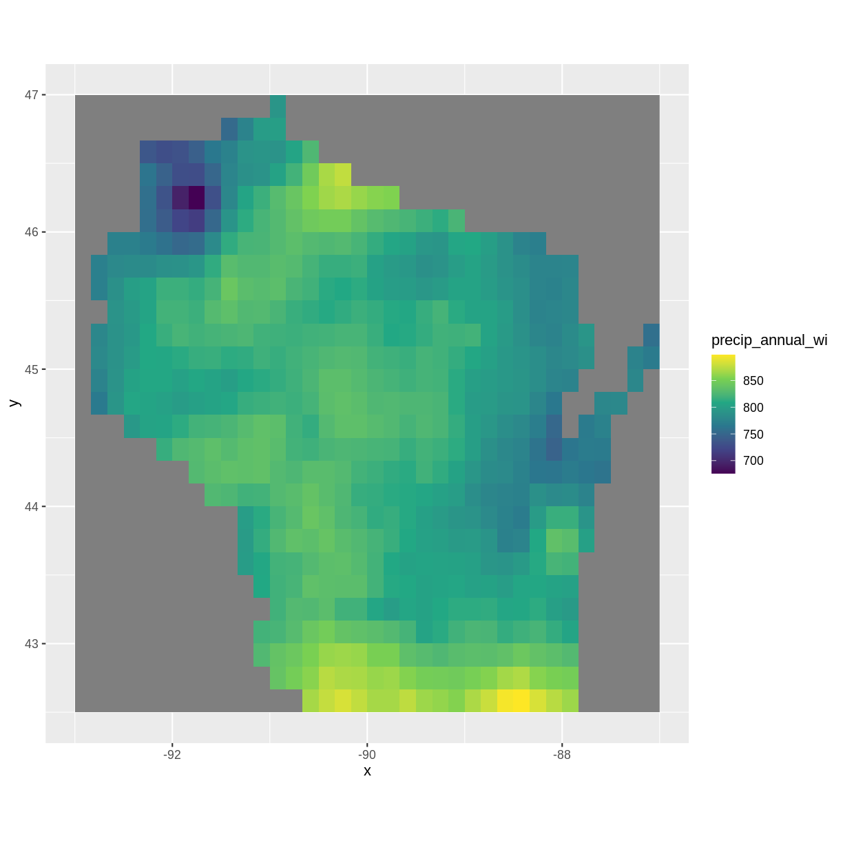
Load in the precipitation raster for Wisconsin and explore the raster. Plot the raster and describe the patterns you observe.
Solution
library(raster)Loading required package: splibrary(ggplot2) library(rgdal)rgdal: version: 1.5-23, (SVN revision 1121) Geospatial Data Abstraction Library extensions to R successfully loaded Loaded GDAL runtime: GDAL 3.0.4, released 2020/01/28 Path to GDAL shared files: /usr/share/gdal GDAL binary built with GEOS: TRUE Loaded PROJ runtime: Rel. 6.3.1, February 10th, 2020, [PJ_VERSION: 631] Path to PROJ shared files: /usr/share/proj Linking to sp version:1.4-5 To mute warnings of possible GDAL/OSR exportToProj4() degradation, use options("rgdal_show_exportToProj4_warnings"="none") before loading rgdal.precip <- raster("../data/precip_annual_wi.tif") summary(precip)precip_annual_wi Min. 676 1st Qu. 795 Median 814 3rd Qu. 827 Max. 898 NA's 377precip_df <- as.data.frame(precip, xy=TRUE) ggplot() + geom_raster(data=precip_df, aes(x=x, y=y,fill=precip_annual_wi))+ scale_fill_viridis_c() + coord_quickmap()
Annual precipitation is highest near the Illinois border and near Iron county. It is lowest near Douglas and Washburn county.
2) Raster math using overlay(): calculating the difference
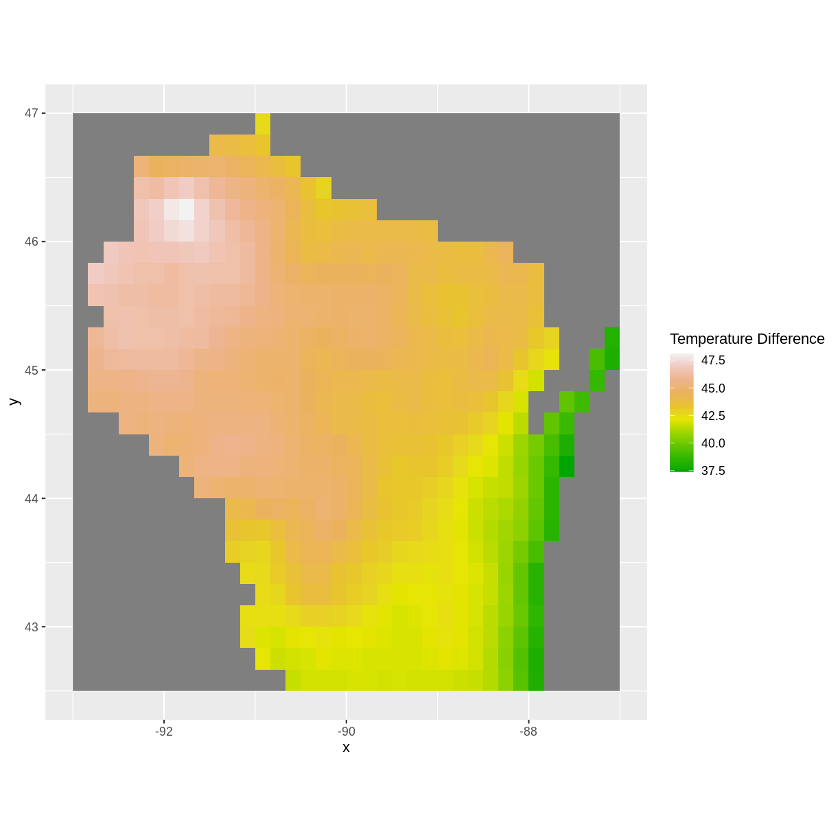
Load in the maximum and minimum temperature rasters for Wisconsin. Subtract the minimum temperature from the maximum temperature using the overlay() function and plot your results. Note what you observe.
Solution
mintemp <- raster("../data/mintemp_monthcold_wi.tif")
maxtemp <- raster("../data/maxtemp_monthwarm_wi.tif")

diff <- overlay(maxtemp, mintemp,
                       fun = function(r1, r2) { return( r1 - r2) })

diff_df <- as.data.frame(diff, xy=TRUE)

ggplot() +
  geom_raster(data = diff_df,
              aes(x = x, y = y, fill = layer)) +
  scale_fill_gradientn(name = "Temperature Difference", colors = terrain.colors(10)) +
  coord_quickmap()
Near Lake Michigan, the difference between maximum and minimum temperature was lowest, again possibly due to the lake effect. The largest differences in maximum and minimum temperatures was near the Minnesota border.
3) Raster math using overlay(): calculating the average
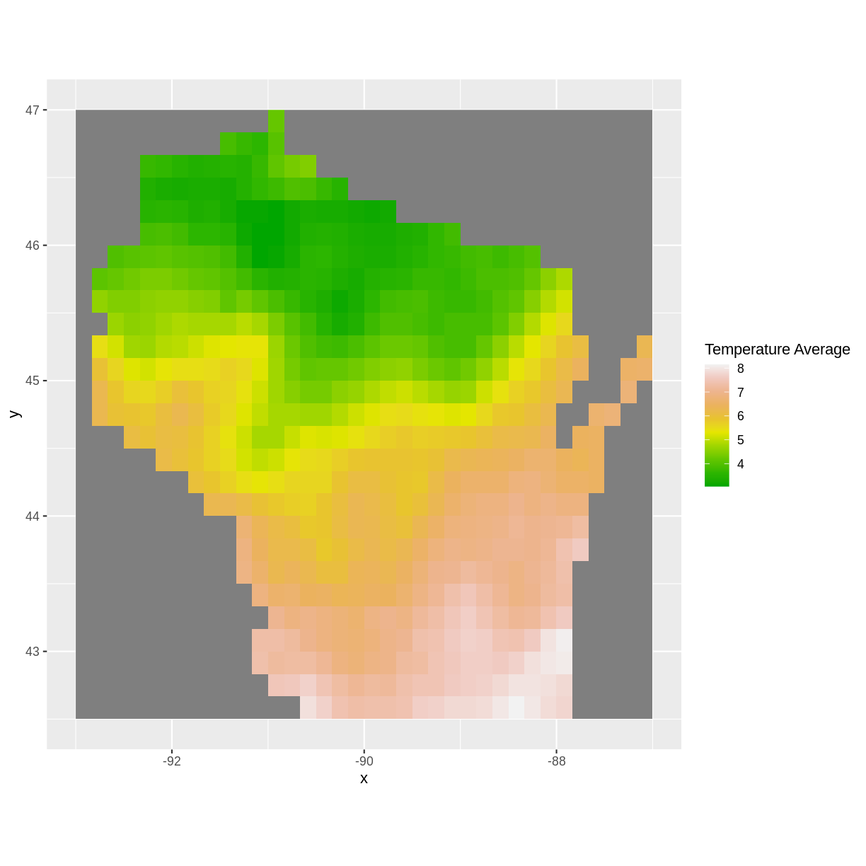
Use the overlay() function again to calculate the average temperature, using the maximum and minimum temperature rasters. Plot your results and note what you observe.
Solution
avg <- overlay(maxtemp, mintemp,
              fun = function(r1, r2) { return( (r1 + r2)/2) })
#alternative:
#avg <- overlay(maxtemp, mintemp, fun = mean)

avg_df <- as.data.frame(avg, xy=TRUE)

ggplot() +
  geom_raster(data = avg_df,
              aes(x = x, y = y, fill = layer)) +
  scale_fill_gradientn(name = "Temperature Average", colors = terrain.colors(10)) +
  coord_quickmap()
The average temperatures are higher toward the Illinois border and lower up north.
Key Points
Always explore your data and note initial geospatial insights.
The overlay() function can be used to calculate different summary statistics for your raster.
With the overlay() function, you can begin to develop your skills in writing functions.


