Introduction
Overview
Teaching: 0 min
Exercises: 0 minQuestions
Key question (FIXME)
Objectives
First learning objective. (FIXME)
FIXME
Key Points
First key point. Brief Answer to questions. (FIXME)
Day 1: Introduction to Geospatial Concepts
Overview
Teaching: 0 min
Exercises: 0 minQuestions
What format should I use to represent my data?
What are the main data types used for representing geospatial data?
What are the main attributes of raster and vector data?
Objectives
Describe the difference between raster and vector data.
Describe the stregnths and weaknesses of storing data in raster vs. vector formats.
Distinguish between continuous and categorical raster data, and identify types of datasets that would be stored in each format.
Describe the three types of vectors and identify types of data that would be stored in each.
This episode reviews the two primary types of geospatial data: rasters and vectors. It provides an overview of these two types of geospatial data, describing major features of both and providing examples of where you might find each type.
Data Structures: Raster and Vector
Raster data is any pixelated (or gridded) data where each pixel is associated with a specific geographic location. The value of a pixel can be continuous (e.g. elevation) or categorical (e.g. land use). This data structure is very common: it’s how we represent any digital image. A geospatial raster is only different from a digital photo in that it is accompanied by spatial information that connects the data to a particular location. This includes the raster’s extent and cell size, the number of rows and columns, and its coordinate reference system (CRS).
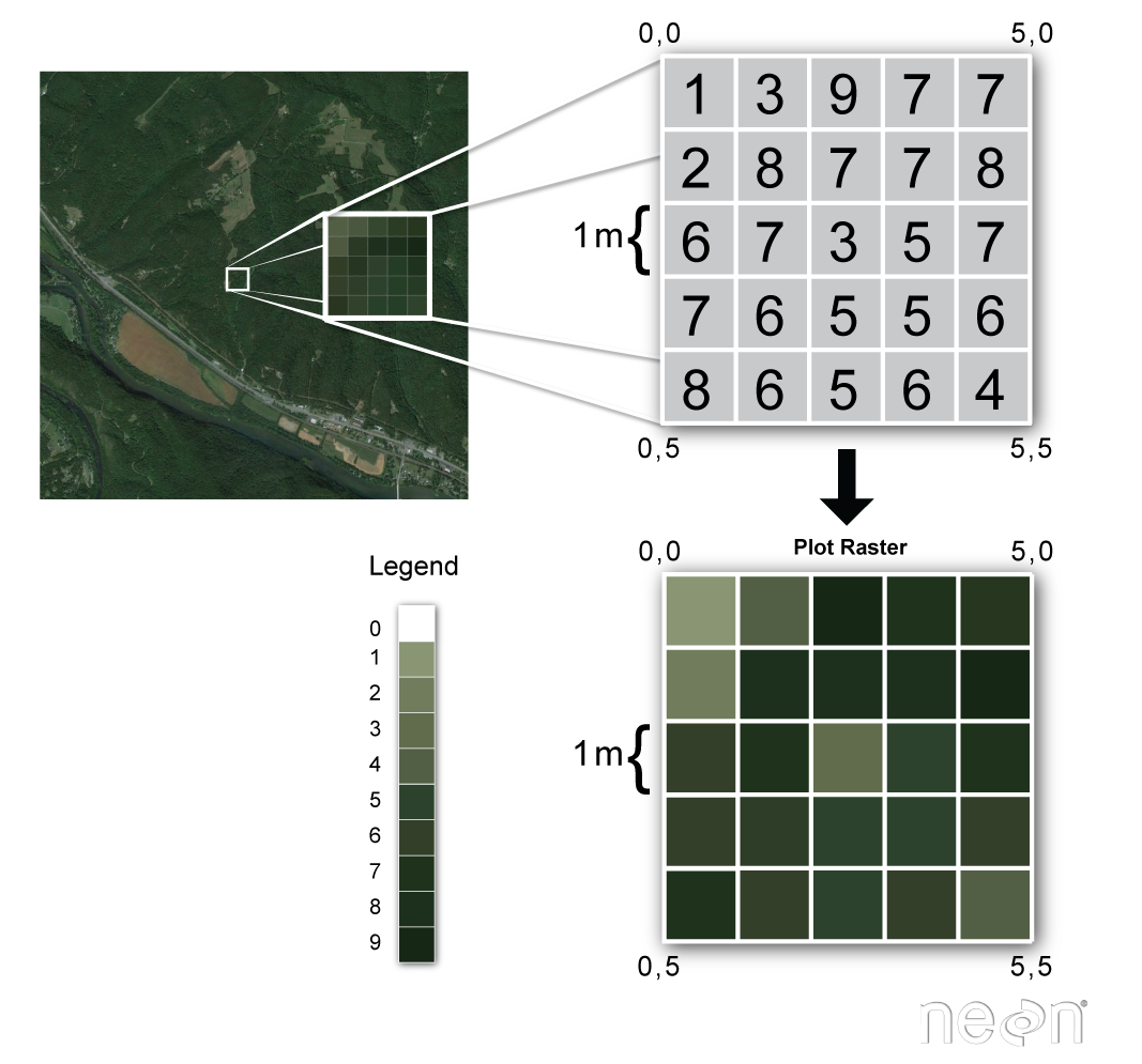
Source: National Ecological Observatory Network (NEON)
Some examples of continuous rasters include:
- Precipitation maps
- Maps of tree height derived from LiDAR data
- Elevation values for a region
Some rasters contain categorical data where each pixel represents a discrete class such as landcover type (e.g., “forest” or “grassland”) rather than a continuous value such as elevation or temperature. Some examples of classified maps include:
- Land-cover/land-use maps
- Tree height maps classified as short, medium, and tall trees
- Elevation maps classified as low, medium, and high elevation
Source: United States Geological Survey (USGS)
Advantages and Disadvantages
With a partner, brainstorm potential advantages and disadvantages of storing data in raster format.
Solution
Raster data has some important advantages:
- representation of continuous surfaces
- potentially very high levels of detail
- data is ‘unweighted’ across its extent - the geometry doesn’t implicitly highlight features
- cell-by-cell calculations can be very fast and efficient
The downsides of raster data are:
- file sizes become very large as the cell size gets smaller (more pixels)
- currently popular formats don’t embed metadata well
- can be difficult to represent complex information
Important Attributes of Raster Data
Extent
The spatial extent is the geographic area that the raster data covers. The spatial extent of an R spatial object represents the geographic edge or location that is the furthest north, south, east, and west. In other words, extent represents the overall geographic coverage of the spatial object.
Resolution
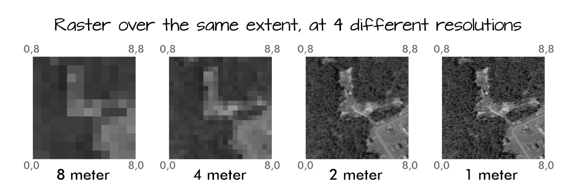
The spatial resolution of a raster represents the area on the ground that each pixel of the raster covers.
Source: National Ecological Observatory Network (NEON)
Multi-band Raster Data
A raster can contain one or more bands. One type of multi-band raster dataset that is familiar to many of us is a color image. A basic color image consists of three bands: red, green, and blue. Each band represents light reflected from the red, green, or blue portions of the electromagnetic spectrum. The pixel brightness for each band, when composited, creates the colors that we see in an image. In a multi-band dataset, the rasters will always have the same extent, resolution, and CRS.
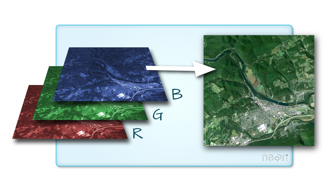
Source: National Ecological Observatory Network (NEON)
Raster Data Format for this Capstone
Raster data can come in many different formats. For this capstone, we’ve offered data in the GeoTIFF format, which has the extension .tif. A .tif file stores metadata or attributes about the file as embedded .tif tags. For instance, your camera might store a tag that describes the make and model of the camera or the date that the photo was taken when it saves a .tif. A GeoTIFF is a standard .tif image format with additional spatial (georeferencing) information embedded in the file as tags. These tags should include the following raster metadata:
- Extent
- Resolution
- Coordinate Refernce System (CRS) - you’ll explore this concept in a later episode.
- Values that represent missing data (
NoDataValue).
Spatial Questions with Raster Data
What kinds of geographic questions can you ask using raster data? Brainstorm a few with your neighbor or in a breakout room.
Solution
How are precipitation patterns different across space? How does average temperature differ across space?
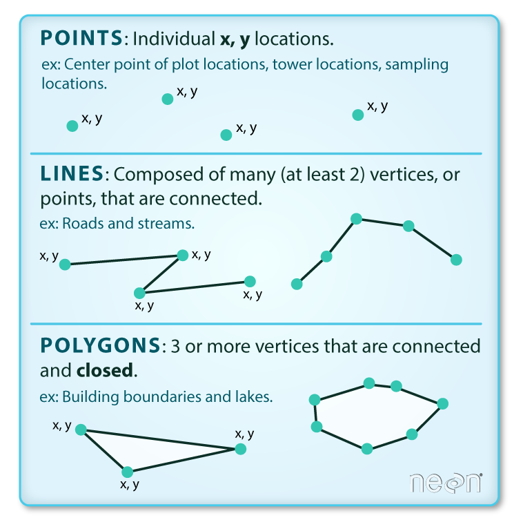
About Vector Data
Vector data structures represent specific features on the Earth’s surface, and assign attributes to those features. Vectors are composed of discrete geometric locations (x, y values) known as vertices that define the shape of the spatial object. The organization of the vertices determines the type of vector that we are working with: point, line, or polygon.
Source: National Ecological Observatory Network (NEON)
-
Points: Each point is defined by a single x, y coordinate. There can be many points in a vector point file. Examples of point data include: sampling locations, the location of individual trees, or the location of survey plots.
-
Lines: Lines are composed of many (at least 2) points that are connected. For instance, a road or a stream may be represented by a line. This line is composed of a series of segments, each “bend” in the road or stream represents a vertex that has a defined x, y location.
-
Polygons: A polygon consists of 3 or more vertices that are connected and closed. The outlines of survey plot boundaries, lakes, oceans, and states or countries are often represented by polygons.
Data Tip
Sometimes, boundary layers such as states and countries, are stored as lines rather than polygons. However, these boundaries, when represented as a line, will not create a closed object with a defined area that can be filled.
Advantages and Disadvantages
With your neighbor, brainstorm potential advantages and disadvantages of using vector data.
Solution
Vector data has some important advantages:
- the geometry itself contains information about what the dataset creator thought was important
- the geometry structures hold information in themselves — why choose point over polygon, for instance?
- each geometry feature can carry multiple attributes instead of just one, e.g. a database of cities can have attributes for name, country, population, etc.
- data storage can be very efficient compared to rasters
The downsides of vector data are:
- potential loss of detail compared to raster
- potential bias in datasets — what didn’t get recorded?
- calculations involving multiple vector layers need to do math on the geometry as well as on the attributes, so can be slow compared to raster math.
Vector datasets are in use in many industries besides geospatial fields. For instance, computer graphics are largely vector-based, although the data structures in use tend to join points using arcs and complex curves rather than straight lines. Computer-aided design (CAD) is also vector-based. The difference is that geospatial datasets are accompanied by information tying their features to real-world locations.
Vector Data Format for this Capstone
Like raster data, vector data can also come in many different formats. For this capstone, we’ll use the Shapefile format, which has the extension .shp. A .shp file stores the geographic coordinates of each vertice in the vector, as well as metadata including:
- Extent: the spatial extent of the shapefile (i.e., geographic area that the shapefile covers). The spatial extent for a shapefile represents the combined extent for all spatial objects in the shapefile.
- Object type: whether the shapefile includes points, lines, or polygons.
- Coordinate Reference System (CRS): defines how the two-dimensional, projected map relates to real places on the earth. The decision of which map projection and CRS to use depends on the regional extent of the area you want to work in, on the analysis you want to do, and often on the availability of data.
- Other Attributes: for example, a line shapefile that contains the locations of streams, might contain the name of each stream.
Because the structure of points, lines, and polygons are different, each individual shapefile can only contain one vector type (all points, all lines, or all polygons). You will not find a mixture of point, line, and polygon objects in a single shapefile. A shapefile is actually a directory of files that contain different attributes about the data — you’ll learn more about this when you begin to work with vector data.
More Resources
More about shapefiles can be found on Wikipedia
Why Not Both?
Very few formats can contain both raster and vector data - in fact, most are even more restrictive than that. Vector datasets are usually locked to one geometry type, e.g. points only. Raster datasets can usually only encode one data type; for example, you can’t have a multi-band GeoTIFF where one layer is integer data and another is floating point. There are sound reasons for this: format standards are easier to define and maintain, and so is metadata. The effects of particular data manipulations are more predictable if you are confident that all of your output data has the same characteristics.
Research Questions for Vector Data
Brainstorm potential research questions you could use vector data to answer, with a partner or in a breakout room.
Solution
What counties had the highest and lowest precipitation in 1990?
Key Points
Raster data is pixelated data where each pixel is associated with a specific location.
Raster data always has an extent and a resolution.
The extent is the geographical area covered by a raster.
The resolution is the area covered by each pixel of a raster.
Vector data structures represent specific features on the Earth’s surface along with attributes of those features.
Vector objects are either points, lines, or polygons.
Day 2: Introduction to Raster Data
Overview
Teaching: min
Exercises: 5 minQuestions
What are the coordinate reference systems for your rasters and are they the same?
Objectives
Visually explore the patterns in your rasters. Reproject the your raster into UTM coordinates.
Outline
- Intro + Minute questions (10-15 min.)
- Raster Capstone (30-40 min.):
- Load and summarize the raster data
- Visualize the raster data
- Develop insights
- Reproject your raster
- Outro + Final Questions (10-15 min.)
In this capstone lesson, we use the following capstone data:
- A raster of maximum temperature in Wisconsin
- A raster of minimum temperature in Wisconsin
If you are using your own data, please identify two (2) rasters with continuous values and that are unprojected.
1) Load and summarize
Practice the first steps of using data by loading in the maximum and minimum temperature rasters for Wisconsin using the raster() function and then exploring using the summary() function.
Solution
library(raster)Loading required package: splibrary(ggplot2) library(rgdal)rgdal: version: 1.5-23, (SVN revision 1121) Geospatial Data Abstraction Library extensions to R successfully loaded Loaded GDAL runtime: GDAL 3.0.4, released 2020/01/28 Path to GDAL shared files: /usr/share/gdal GDAL binary built with GEOS: TRUE Loaded PROJ runtime: Rel. 6.3.1, February 10th, 2020, [PJ_VERSION: 631] Path to PROJ shared files: /usr/share/proj Linking to sp version:1.4-5 To mute warnings of possible GDAL/OSR exportToProj4() degradation, use options("rgdal_show_exportToProj4_warnings"="none") before loading rgdal.mintemp <- raster("../data/mintemp_monthcold_wi.tif") summary(mintemp)mintemp_monthcold_wi Min. -20.70 1st Qu. -18.20 Median -16.70 3rd Qu. -14.45 Max. -11.10 NA's 377.00maxtemp <- raster("../data/maxtemp_monthwarm_wi.tif") summary(maxtemp)maxtemp_monthwarm_wi Min. 24.9 1st Qu. 26.5 Median 27.6 3rd Qu. 28.2 Max. 29.0 NA's 377.0
2) Check the CRS
Use the crs() function to check if the coordinate reference systems the same in these two rasters?
Solution
mintempclass : RasterLayer dimensions : 27, 36, 972 (nrow, ncol, ncell) resolution : 0.1666667, 0.1666667 (x, y) extent : -93, -87, 42.5, 47 (xmin, xmax, ymin, ymax) crs : +proj=longlat +datum=WGS84 +no_defs source : mintemp_monthcold_wi.tif names : mintemp_monthcold_wi values : -20.7, -11.1 (min, max)maxtempclass : RasterLayer dimensions : 27, 36, 972 (nrow, ncol, ncell) resolution : 0.1666667, 0.1666667 (x, y) extent : -93, -87, 42.5, 47 (xmin, xmax, ymin, ymax) crs : +proj=longlat +datum=WGS84 +no_defs source : maxtemp_monthwarm_wi.tif names : maxtemp_monthwarm_wi values : 24.9, 29 (min, max)OR
crs(mintemp)CRS arguments: +proj=longlat +datum=WGS84 +no_defscrs(maxtemp)CRS arguments: +proj=longlat +datum=WGS84 +no_defsYes, the CRS for both rasters is the same. Both are in longlat projection, datum WGS84.
3) Visualize
Create visualizations of both minimum and maximum temperature rasters using the ggplot2 package.
Solution
mintemp_df <- as.data.frame(mintemp, xy=TRUE) maxtemp_df <- as.data.frame(maxtemp, xy=TRUE)ggplot() + geom_raster(data = mintemp_df , aes(x = x, y = y, fill = mintemp_monthcold_wi)) + scale_fill_viridis_c() + coord_quickmap()
ggplot() +
   geom_raster(data = maxtemp_df , aes(x = x, y = y, fill = maxtemp_monthwarm_wi)) +
   scale_fill_viridis_c() +
   coord_quickmap()


Bonus
You can add the following aesthetics to a ggplot to customize the backgrounds, axis labels, title, legend label, and move the legend position to the bottom of the plot:
ggplot() +
    geom_*() +
    labs(title = "Your Title", x="X Label", y="Y Label", fill="Legend Label") +
    theme_bw() +
    theme(plot.title = element_text(hjust = 0.5), legend.position = "bottom")
Explore what these aesthetics do with your plot of maximum monthly temperature.
Solution
ggplot() +
   geom_raster(data = maxtemp_df , aes(x = x, y = y, fill = maxtemp_monthwarm_wi)) +
   scale_fill_viridis_c() +
   coord_quickmap() +
   labs(title = "Maximum Monthly Temperature: WI", x="Longitude", y="Latitude", fill="Max. Temp (C)") +
   theme_bw() +
   theme(plot.title = element_text(hjust = 0.5), legend.position = "bottom")

4) Develop insights
Describe what patterns you observe across the state for coldest and warmest monthly temperatures in Wisconsin. What do you hypothesize is the effect of Lake Michigan?
Solution
Warmer temperatures are in Wisconsin tend toward the lower half of the state and nearer to the Minnesota border. Colder temperatures tend toward the North and near Lake Michigan, possibly due to the lake effect
5) Reproject
Reproject the maxtemp raster into UTM coordinates using the following crs string: ` +proj=utm +zone=15 +datum=WGS84 +units=m +no_defs +ellps=WGS84 +towgs84=0,0,0 `. This string was obtained from Spatial Reference Orig under PROJ4.
Solution
maxtemp_utm <- projectRaster(maxtemp, crs=" +proj=utm +zone=15 +datum=WGS84 +units=m +no_defs +ellps=WGS84 +towgs84=0,0,0 ")
crs(maxtemp_utm)
CRS arguments: +proj=utm +zone=15 +datum=WGS84 +units=m +no_defscrs(maxtemp)CRS arguments: +proj=longlat +datum=WGS84 +no_defs
Key Points
Always explore your raster first using the summary() and crs() functions.
To plot your raster with ggplot(), first convert your raster to a data frame using the as.data.frame() function and specify the argument xy=TRUE.
You may need to reproject your raster, for which you can use the projectRaster() function.
There are many plotting and aesthetics options in the ggplot2 package for you to explore.
Day 3: Introduction to Raster Data
Overview
Teaching: min
Exercises: 3 minQuestions
What is the average of the minimum and maximum values of your raster and what patterns do you observe?
Objectives
Import and explore multiple rasters and develop initial geospatial insights. Use raster math to to calculate different summary statistics.
Load in and explore the rasters, describe the patterns you observe. Perform raster math.
Outline
- Intro + Minute questions (10-15 min.)
- Raster Capstone (30-40 min.):
- Load, summarize, and visualize your raster
- Use the
overlay()function to perform raster math
- Outro + Final Questions (10-15 min.)
In this capstone lesson, we use the following capstone data:
- A raster of precipitation in Wisconsin
- A raster of maximum temperature in Wisconsin
- A raster of minimum temperature in Wisconsin
If you are using your own data, please identify two (3) rasters with continuous values that are unprojected. You may use the same 2 rasters from the previous section.
1) Load, summarize, and visualize
Load in the precipitation raster for Wisconsin and explore the raster. Plot the raster and describe the patterns you observe.
Solution
library(raster)Loading required package: splibrary(ggplot2) library(rgdal)rgdal: version: 1.5-23, (SVN revision 1121) Geospatial Data Abstraction Library extensions to R successfully loaded Loaded GDAL runtime: GDAL 3.0.4, released 2020/01/28 Path to GDAL shared files: /usr/share/gdal GDAL binary built with GEOS: TRUE Loaded PROJ runtime: Rel. 6.3.1, February 10th, 2020, [PJ_VERSION: 631] Path to PROJ shared files: /usr/share/proj Linking to sp version:1.4-5 To mute warnings of possible GDAL/OSR exportToProj4() degradation, use options("rgdal_show_exportToProj4_warnings"="none") before loading rgdal.precip <- raster("../data/precip_annual_wi.tif") summary(precip)precip_annual_wi Min. 676 1st Qu. 795 Median 814 3rd Qu. 827 Max. 898 NA's 377precip_df <- as.data.frame(precip, xy=TRUE) ggplot() + geom_raster(data=precip_df, aes(x=x, y=y,fill=precip_annual_wi))+ scale_fill_viridis_c() + coord_quickmap()
Annual precipitation is highest near the Illinois border and near Iron county. It is lowest near Douglas and Washburn county.

2) Raster math using overlay(): calculating the difference
Load in the maximum and minimum temperature rasters for Wisconsin. Subtract the minimum temperature from the maximum temperature using the overlay() function and plot your results. Note what you observe.
Solution
mintemp <- raster("../data/mintemp_monthcold_wi.tif")
maxtemp <- raster("../data/maxtemp_monthwarm_wi.tif")

diff <- overlay(maxtemp, mintemp,
                       fun = function(r1, r2) { return( r1 - r2) })

diff_df <- as.data.frame(diff, xy=TRUE)

ggplot() +
  geom_raster(data = diff_df,
              aes(x = x, y = y, fill = layer)) +
  scale_fill_gradientn(name = "Temperature Difference", colors = terrain.colors(10)) +
  coord_quickmap()
Near Lake Michigan, the difference between maximum and minimum temperature was lowest, again possibly due to the lake effect. The largest differences in maximum and minimum temperatures was near the Minnesota border.

3) Raster math using overlay(): calculating the average
Use the overlay() function again to calculate the average temperature, using the maximum and minimum temperature rasters. Plot your results and note what you observe.
Solution
avg <- overlay(maxtemp, mintemp,
              fun = function(r1, r2) { return( (r1 + r2)/2) })
#alternative:
#avg <- overlay(maxtemp, mintemp, fun = mean)

avg_df <- as.data.frame(avg, xy=TRUE)

ggplot() +
  geom_raster(data = avg_df,
              aes(x = x, y = y, fill = layer)) +
  scale_fill_gradientn(name = "Temperature Average", colors = terrain.colors(10)) +
  coord_quickmap()
The average temperatures are higher toward the Illinois border and lower up north.

Key Points
Always explore your data and note initial geospatial insights.
The overlay() function can be used to calculate different summary statistics for your raster.
With the overlay() function, you can begin to develop your skills in writing functions.
Day 4: Exploring Vector Data
Overview
Teaching: min
Exercises: 7 minQuestions
Are two datasets from two different sources suitable to be plotted together?
What spatial patterns can we see by visual analysis?
What are some plotting options to impact the way data are visualized?
Objectives
Importing vector data and visually explore the vector data through attributes and by visualization.
In this capstone lesson, we will work with two Wisconsin vector data files: precipitation, and county boundaries. If you are using your own data, please identify 2 different vector files that you can use to summarize and visualize in this lesson. The learning objectives of this capstone are to demonstrate an example workflow of loading, exploring, and plotting vectors.
1) Load Libraries
Load these libraries if you don’t already have them (dplyr, ggplot2, sf, rgdal)
Solution
library(dplyr)Error in library(dplyr): there is no package called 'dplyr'library(ggplot2) library(sf)Linking to GEOS 3.8.0, GDAL 3.0.4, PROJ 6.3.1library(rgdal)Loading required package: sprgdal: version: 1.5-23, (SVN revision 1121) Geospatial Data Abstraction Library extensions to R successfully loaded Loaded GDAL runtime: GDAL 3.0.4, released 2020/01/28 Path to GDAL shared files: /usr/share/gdal GDAL binary built with GEOS: TRUE Loaded PROJ runtime: Rel. 6.3.1, February 10th, 2020, [PJ_VERSION: 631] Path to PROJ shared files: /usr/share/proj Linking to sp version:1.4-5 To mute warnings of possible GDAL/OSR exportToProj4() degradation, use options("rgdal_show_exportToProj4_warnings"="none") before loading rgdal.
2) Load vector files
In this exercise, we have provided two capstone vector data files: Wisconsin Annual Precipitation Average 1981-2010, and county outlines. You can work with these, or with your own vector datasets.
Filenames: precip1981_2010_a_wi.shp and WI_Counties2010.shp
Note about the Shapefile format
Although we will be importing Shapefiles using the name of a single file with the extension “.shp” be aware that a Shapefile actually consists of a folder of multiple files, each having the same name but with different extensions. The multiple files in the folder each contain information about different aspects of the geospatial data. For more information see “What is a Shapefile?” https://www.gislounge.com/what-is-a-shapefile/
Solution
wi_precip <- st_read("../data/precipitation/precip1981_2010_a_wi.shp")Reading layer `precip1981_2010_a_wi' from data source `/home/runner/work/geospatial-capstone/geospatial-capstone/data/precipitation/precip1981_2010_a_wi.shp' using driver `ESRI Shapefile' Simple feature collection with 11 features and 3 fields Geometry type: MULTIPOLYGON Dimension: XY Bounding box: xmin: -92.88943 ymin: 42.49172 xmax: -86.75393 ymax: 47.11257 Geodetic CRS: WGS 84wi_county <- st_read("../data/WI_Counties2010/WI_Counties2010.shp")Reading layer `WI_Counties2010' from data source `/home/runner/work/geospatial-capstone/geospatial-capstone/data/WI_Counties2010/WI_Counties2010.shp' using driver `ESRI Shapefile' Simple feature collection with 72 features and 6 fields Geometry type: MULTIPOLYGON Dimension: XY Bounding box: xmin: -92.88811 ymin: 42.49192 xmax: -86.80542 ymax: 47.08001 Geodetic CRS: WGS 84## County data is from here https://geo.btaa.org/catalog/4E677AF3-3FF2-43FA-8A58-3C345EC7F465
3) Explore metadata
We have worked with functions to explore the geometry type, and projection of vector data files. Examples include:st_geometry_type(), st_crs(), st_bbox(), as well as reviewing the output produced in R when you imported the shapefiles.
Explore the metadata of the shapefiles. We will work towards combining these files in the same plot. Are these files suited to being plotted together - for example, are they in the same CRS and cover the same area?
Solution
st_geometry_type(wi_precip)[1] MULTIPOLYGON MULTIPOLYGON MULTIPOLYGON MULTIPOLYGON MULTIPOLYGON [6] MULTIPOLYGON MULTIPOLYGON MULTIPOLYGON MULTIPOLYGON MULTIPOLYGON [11] MULTIPOLYGON 18 Levels: GEOMETRY POINT LINESTRING POLYGON MULTIPOINT ... TRIANGLEst_crs(wi_precip)$proj4string[1] "+proj=longlat +datum=WGS84 +no_defs"st_bbox(wi_precip)xmin ymin xmax ymax -92.88943 42.49172 -86.75393 47.11257st_geometry_type(wi_county)[1] MULTIPOLYGON MULTIPOLYGON MULTIPOLYGON MULTIPOLYGON MULTIPOLYGON [6] MULTIPOLYGON MULTIPOLYGON MULTIPOLYGON MULTIPOLYGON MULTIPOLYGON [11] MULTIPOLYGON MULTIPOLYGON MULTIPOLYGON MULTIPOLYGON MULTIPOLYGON [16] MULTIPOLYGON MULTIPOLYGON MULTIPOLYGON MULTIPOLYGON MULTIPOLYGON [21] MULTIPOLYGON MULTIPOLYGON MULTIPOLYGON MULTIPOLYGON MULTIPOLYGON [26] MULTIPOLYGON MULTIPOLYGON MULTIPOLYGON MULTIPOLYGON MULTIPOLYGON [31] MULTIPOLYGON MULTIPOLYGON MULTIPOLYGON MULTIPOLYGON MULTIPOLYGON [36] MULTIPOLYGON MULTIPOLYGON MULTIPOLYGON MULTIPOLYGON MULTIPOLYGON [41] MULTIPOLYGON MULTIPOLYGON MULTIPOLYGON MULTIPOLYGON MULTIPOLYGON [46] MULTIPOLYGON MULTIPOLYGON MULTIPOLYGON MULTIPOLYGON MULTIPOLYGON [51] MULTIPOLYGON MULTIPOLYGON MULTIPOLYGON MULTIPOLYGON MULTIPOLYGON [56] MULTIPOLYGON MULTIPOLYGON MULTIPOLYGON MULTIPOLYGON MULTIPOLYGON [61] MULTIPOLYGON MULTIPOLYGON MULTIPOLYGON MULTIPOLYGON MULTIPOLYGON [66] MULTIPOLYGON MULTIPOLYGON MULTIPOLYGON MULTIPOLYGON MULTIPOLYGON [71] MULTIPOLYGON MULTIPOLYGON 18 Levels: GEOMETRY POINT LINESTRING POLYGON MULTIPOINT ... TRIANGLEst_crs(wi_county)$proj4string[1] "+proj=longlat +datum=WGS84 +no_defs"st_bbox(wi_county)xmin ymin xmax ymax -92.88811 42.49192 -86.80541 47.08001The CRS for both vectors is the same. Both are in longlat projection, datum WGS84. You may notice that the bounding box limits are slightly different. Since the limits are similar, we will continue working with them with the intent to plot them together, and make a note to inspect the plots and see why the limits are different.
4) Explore attributes. Identify attribute(s) of interest
If you are working with the capstone data, identify the attribute that appears to contain the precipitation data, and the attribute of county name. If you are working with your data, choose an attribute of interest to work with for plotting.
There are multiple ways to explore the attributes of a spatial data file. We have worked with the names() function and previewing the first 6 rows with the head() functions as well as viewing the file in RStudio’s Environment tab, or printing the shapefile object to the screen.
For a visual method to explore attributes, you can try the plot() function built into sf. This plots a small map for each of the attributes. For example
plot(wi_precip)
Notice that this plot() command displays attribute names but does not display data values.
plot(wi_precip)

plot(wi_county)

5) Using ggplot2 to plot data with selected attribute of interest
If working with the capstone data, plot the precipitation shapefile using the attribute you identified as the precipitation data to set the fill. One way to do this is to use a fill aesthetic mapped to the column name of the attribute you identified aes(fill = )
Solution
# Using aes in  ggplot2
ggplot() +
 geom_sf(data = wi_precip, aes(fill = PrecipInch), size = 0.1) +
 ggtitle("Wisconsin Annual Precipitation Average 1981 - 2010, In Inches") +
 coord_sf()

6) Spatial Questions Discussion
What do you see in the plotted map? For example, where are the highest/lowest values, and are there patterns across the state? How many different categories are there? Notice the default colors and how they are associated with the data values. Do you think this color scale is a good choice for the data? Can you easily read the different color values on the plot, and connect them to the data value? Is the color range intuitive to understand? Could this be symbolized better?
It is a common convention in map symbology to use darker colors for higher data values. We can do this in ggplot2 by reversing the color range.
Add the line scale_fill_continuous(trans = 'reverse') +
Solution
#Plot a shapefile, reverse the colors
ggplot() +
 geom_sf(data = wi_precip, aes(fill = PrecipInch), size = 0.1) +
 scale_fill_continuous(trans = 'reverse') +   ## reverses color scale
 ggtitle("Wisconsin Annual Precipitation Average 1981 - 2010, In Inches") +
 coord_sf()

7) Plot multiple vector shapefiles
You can use ggplot2 to plot mutiple vector shapefiles layered in a single plot. For example, adding a layer of the county outlines over the plot of precipitation with a second use of the geom_sf() command. One design option to try is to make choices about the color and thickness of the county lines.
Solution
ggplot() +
  geom_sf(data = wi_precip, aes(fill = PrecipInch), size = 0.1) +
  geom_sf(data = wi_county, fill = NA, color = gray(.5)) +
  scale_fill_continuous(trans = 'reverse') +        ## reverses color scale
  ggtitle("Wisconsin Annual Precipitation Average 1981 - 2010, In Inches") +
  coord_sf()

Bonus: Try different color palette
R offers a number of color packages that allow you to choose from a variety of color ranges. One example of a color palette is colorspace
The hcl_palettes function will print the colorspace palette to the screen
 # install.packages("colorspace")
 library(colorspace)
 hcl_palettes(plot = TRUE)

You can assign colors from a palette to the unique values in a range, as in our precipitation data. First, determine the number of unique values.
 wi_precip_uniq <- unique(wi_precip$Inches)
 length(wi_precip_uniq)
[1] 11
In the case of our precipitation data, there are 11 unique values. This code example selects the palette “Purples 3” and reverses the order of the colors.
colors <- sequential_hcl(11, palette = "Purples 3")  #11 categories
colors <- rev(colors)   #reverses order
The cut_interval() function can be used to assign the range of data values into a given number of groups. In this example we are using cut_interval() as an aspect of assigning a plot color to a group of data values within the “Inches” attribute . In this case, using 11 groups for cut_interval() assigns a color to each unique data value.
 ggplot() +
  geom_sf(data = wi_precip, aes(fill = cut_interval(Inches, (11)))) +
  scale_fill_manual(values = colors) +
  ggtitle("Wisconsin Avg. Annual Precipitation 1981-2000") +
  coord_sf()

Changing the value in the cut_interval() function to a number that is less than the number of unique values will combine multiple data values into a range plotted as the same color. This can be helpful to simplify the appearance of a plot with several unique data values.
This example assigns the values of the “Inches” attribute to five categories.
ggplot() +
  geom_sf(data = wi_precip, aes(fill = cut_interval(Inches, (5)))) +
  scale_fill_manual(values = colors) +
  ggtitle("Wisconsin Avg. Annual Precipitation 1981-2000") +
  coord_sf()

Notice that the polygons plot with outlines of each unique data value category, even though multiple data value categories are plotted with the same color. This can be a confusing appearance since the outlines don’t align with the color fills. This can be helped by setting the fill lineweight lwd to 0, suppressing the outlines.
ggplot() +
  geom_sf(data = wi_precip, aes(fill = cut_interval(Inches, (5))), lwd = 0) +
  scale_fill_manual(values = colors) +
  ggtitle("Wisconsin Avg. Annual Precipitation 1981-2000") +
  coord_sf()

Key Points
- Options for exploring vector files include displaying metadata, and visually examining plots
- R offers design options for the visual display of vector data, including choosing a color palette, and reversing the order of colors assigned to categories
Day 5: Manipulating Raster Data
Overview
Teaching: min
Exercises: minQuestions
How can I summarize raster data based on vector locations
Objectives
Import .csv files containing x,y coordinate locations and convert to a spatial object
Crop a raster to the extent of a vector layer
Extract values from a raster that correspond to a vector file overlay
Outline
- Addressing Minute questions (10-15 minutes)
- Capstone lesson (30-40 minutes)
- Revisit your spatial question
- Load libraries and import data
- Crop raster with a vector
- Summarize raster data by vector locations
- Keypoints and final questions (10-15 minutes)
1) Revisit your spatial question
On day 1 we brainstormed questions you could ask with geospatial data. You thought about questions you can answer with raster data, and separately, questions you could answer with vector data. Through this workshop you have practiced working with spatial data and have the tools to answer your question.
In this final day we will implement tools you learned for combining raster and vector data and the types of questions you can answer when doing so.
A spatial question may look like the following:
- Where does something occur?
- How does something change across space or time?
- What are the differences between locations?
Examples of spatial questions are:
- What county has the highest recorded precipitation?
- Has mean annual temperature increased in the state?
- How does the precipitation vary between Milwaukee and Madison?
Capstone data question: Does it get hotter in Milwaukee or Madison?
In this capstone lesson we will use the following capstone data:
- World Climate raster of maximum temperature (will download)
- Natural Earth populated places vector point data for cities in Wisconsin (provided
ne_10m_populated_places_Wisconsin.csvfile)
We will use the vector data to crop the raster data to the extent of Wisconsin and summarize the raster data using the point locations of Madison and Milwaukee.
If you are using your own data, please have raster and vector data that cover a similar geographic area. Since we are cropping the raster data by the vector data, it will work best if your vector data is of a smaller geographic area than the raster data.
2) Load libraries and import data
For raster data, we use functions in the raster package. For vector data, you will use functions in the sf package. In addition, because we will visualize our data, we will use the plotting package ggplot2.
Solution
library(raster)
library(sf)
library(ggplot2)
Load raster data
The capstone data includes the World Climate Data or “WorldClim”. We will use your coding skills to access the worldclim dataset from the raster package, crop it to our extent of interest, and summarize the data. By the end of this section you should have your raster data as a ‘Formal class RasterLayer’ in your Global Environment
World Climate Data
You can learn about and download the WorldClim from the website: https://www.worldclim.org/data/worldclim21.html For an example of how to use the
rasterpackage to access the WorldClim (raster) data and GADM (vector) data, visit this tutorial: https://www.gis-blog.com/r-raster-data-acquisition/
For the WorldClim data, we need to specify the data variable and the spatial resolution. We will use the [“bio” variable] (https://www.worldclim.org/data/bioclim.html), which are 19 historial bioclimatic variables. The bio variables include things like:
- annual mean temperature
- max temperataure of the warmest month
- annual precipitation
- precipiation of wettest month
The bio variables are available at spatial resolutions of 10 minutes, 5 minutes, 2.5 minutes, and 30 seconds.
Wait, why is spatial resolution in units of time? This is because the spatial coordinates on a sphere are often expressed as degrees-minutes-seconds. 10 minutes is the biggest and 30 seconds is the smallest. An online conversion tool is helpful to understand these unit conversions(https://www.opendem.info/arc2meters.html)
For the capstone data, we want to use the largest spatial resolution of 10 minutes. This means each pixel represents about 13 km on the ground at the approximate latitude of Wisconsin. Within the “bio” variables, we will use the “bio5” variable that represents the maxiumum temperature of the warmest month.
Solution
# get worldclim data, variable "bio" with a 10 minute resolution
# this line is downloading data
# if you selected a resolution higher than 10 (with a res of 0.5,2.5, or 5) it may take a while to download
worldClim_bio_global <- getData("worldclim", var="bio", res=10)

# use only the bio5 variable (BIO5 = Max Temperature of Warmest Month
maxTemp_global <- worldClim_bio_global$bio5

# plot data
plot(maxTemp_global)

Load vector data
The capstone data includes the Natural Earth Populated Places dataset. We have provided the dataset for you as a “.csv” file in the Capstone data folder. By the end of this section you should have a simple feature (‘sf’) data frame type of object in your Global Environment.
Natural Earth Data
You can learn about and download the Natural Earth dataset from the website: https://www.naturalearthdata.com/ You can also download Natural Earth data directly into R using the [
rnaturalearthpackage] (https://cran.r-project.org/web/packages/rnaturalearth/README.html)
Solution
# import point data from a csv file
WIcities <- read.csv("../data/ne_10m_populated_places_Wisconsin.csv")
Warning in file(file, "rt"): cannot open file '../data/ ne_10m_populated_places_Wisconsin.csv': No such file or directoryError in file(file, "rt"): cannot open the connection# check out the data colnames(WIcities)Error in is.data.frame(x): object 'WIcities' not found
Recall from your lesson how to import point data and convert it to a spatial data layer in R.
When looking at the column names we see that there is a lot of data! To convert to a spatial points data layer, we need to know information about the coordinate system and the coordinates for each point.
The column names LATITUDE and LONGITUDE have what we need!
Solution
# convert data frame to sf type of object by specifying coordinates (as xy) and the projection as a crs
WIcities_points <- st_as_sf(WIcities, coords=c('LONGITUDE','LATITUDE'), crs=crs(maxTemp_global))
Error in st_as_sf(WIcities, coords = c("LONGITUDE", "LATITUDE"), crs = crs(maxTemp_global)): object 'WIcities' not found# check class of object - should be "sf" data frame class(WIcities_points)Error in eval(expr, envir, enclos): object 'WIcities_points' not found
A critical part of working with raster and vector data together is that the datasets are in the same coordinate system.
Does it make sense? Are they the same? You can use the functions in the raster package to check out your data.
crs(maxTemp_global)
CRS arguments: +proj=longlat +datum=WGS84 +no_defs
crs(WIcities_points)
Error in h(simpleError(msg, call)): error in evaluating the argument 'x' in selecting a method for function 'crs': object 'WIcities_points' not found
extent(maxTemp_global)
class      : Extent
xmin       : -180
xmax       : 180
ymin       : -60
ymax       : 90
extent(WIcities_points)
Error in h(simpleError(msg, call)): error in evaluating the argument 'x' in selecting a method for function 'extent': object 'WIcities_points' not found
res(maxTemp_global)
[1] 0.1666667 0.1666667
Finally, let’s subset our spatial data to only include the city points we are interested in. For the sample dataset, we are going to subset the data to only include the cities of Madison and Milwaukee.
If you are using your own data, you may or may not need to do this subset or you might want to choose different locations.
Solution
WIcities_points$NAMEError in eval(expr, envir, enclos): object 'WIcities_points' not foundMM_points <- WIcities_points[WIcities_points$NAME=='Madison'|WIcities_points$NAME=='Milwaukee',]Error in eval(expr, envir, enclos): object 'WIcities_points' not found
3) Crop raster with vector
It may be useful to limit the raster data to only areas of interest. This is helpful when you load a larger raster file, such as data for the entire globe, but are only interested in a small part. For our capstone data, we loaded the global temperature data, but we are only interested in the data for Wisconsin, and specifically, the data for Milwaukee and Madison. Let’s use the crop() function in the raster package to cut out the maximum temperature data to only the area for the Wisconsin cities.
Solution
maxTemp_WI <- crop(x = maxTemp_global, y = extent(WIcities_points),snap="out")Error in .local(x, y, ...): Cannot get an Extent object from argument ymaxTemp_WI_df <- as.data.frame(maxTemp_WI, xy=T)Error in h(simpleError(msg, call)): error in evaluating the argument 'x' in selecting a method for function 'as.data.frame': object 'maxTemp_WI' not foundggplot() + geom_raster(data = maxTemp_WI_df,aes(x = x, y = y, fill = bio5)) + geom_sf(data = MM_points,color="yellow",size=5) + coord_sf()Error in fortify(data): object 'maxTemp_WI_df' not found
4) Summarize raster data by vector locations
Now that we have our raster layer that contains the data we want to summarize, and the vector data that contains the locations indicating where we want to summarize the data, we can now put them together.
If you are working with your own data, ask yourself:
- How do I want to summarize the data? For example, do I want a single mean value? A maximum? A distribution of all values?
- What is the area I want to summarize? If it’s a point, do you want a certain distance around the point? Or, if it’s an area, you will include all of the raster values within that area.
Extract pixel values
For the capstone data, we want to extract all the pixel values within a distance buffer of the two city points. Since our data is “unprojected” and therefore the units are in latitude and longitude, the buffer distance will be in meters (hint: this information is in the Help file for the extract() function!)
Geographic and projected unit reminder
Remember, your raster is “unprojected” meaning that the pixels represent distances on a sphere of degrees, minutes, and seconds. You’ll need to consider is the conversation from degrees to meters. The conversions depends on where you are on the globe. For example, at the equator, 1 degree is 111 km. This distance decreases as you move closer to the poles. Try setting the buffer to 50 km or 50,000 meters. This is something you can play around with as you explore the data.
Solution
# extract pixel values from the raster based on the Milwaukee and Madison points
# using a buffer size of 50,000 (50 km around the each point) because the units are in meters
maxTemp_MM <- extract(x=maxTemp_global,df=TRUE,
                           y=MM_points,
                           buffer=50000)
Error in h(simpleError(msg, call)): error in evaluating the argument 'y' in selecting a method for function 'extract': object 'MM_points' not found
Convert data and plot
The last few steps will be small conversions of the datatypes to make it easy for summarizing and plotting.
Solution
# convert to data frame for each calculations and plotting
df_maxTemp_MM <- as.data.frame(maxTemp_MM)
Error in h(simpleError(msg, call)): error in evaluating the argument 'x' in selecting a method for function 'as.data.frame': object 'maxTemp_MM' not found# clean up data frame because we want to give IDs names and convert the temperature data df_maxTemp_MM$ID <- as.factor(df_maxTemp_MM$ID)Error in h(simpleError(msg, call)): error in evaluating the argument 'x' in selecting a method for function 'as.factor': object 'df_maxTemp_MM' not foundlevels(df_maxTemp_MM$ID) = levels(as.factor(MM_points$NAME))Error in h(simpleError(msg, call)): error in evaluating the argument 'x' in selecting a method for function 'levels': error in evaluating the argument 'x' in selecting a method for function 'as.factor': object 'MM_points' not founddf_maxTemp_MM$bio5 <- df_maxTemp_MM$bio5/10Error in eval(expr, envir, enclos): object 'df_maxTemp_MM' not found# plot data ggplot(data = df_maxTemp_MM, aes(x = bio5,fill=ID)) + geom_histogram() + ggtitle("Histogram of maximum temperatures within 50 km of the city") + xlab("Maximum temperature (C)") + ylab("Frequency of Pixels")Error in ggplot(data = df_maxTemp_MM, aes(x = bio5, fill = ID)): object 'df_maxTemp_MM' not found
The graph above shows us the distribution of maximum temperatures within 50 km of Madison and Milwaukee. We have a distribution of values because the extracted data represents each individual pixel within the 50 km buffer. This graph shows us that the maximum temperatures recorded in the Madison are tend to be higher than the maximum temperatures recorded in the Milwaukee region. Does this pattern make sense with your knowledge of the area and the data? Remember, visualizing the data can be important in understanding and explaining patterns.
Key Points
Convert a data frame to an
sfobject using thest_as_sf()function.Use the
crop()andextract()functions to get raster data of spatial subsets.Remember to check if your data align spatially by looking at the projection, extent, and units
Wrap-up
Overview
Teaching: 0 min
Exercises: 0 minQuestions
Key question (FIXME)
Objectives
First learning objective. (FIXME)
FIXME
Key Points
First key point. Brief Answer to questions. (FIXME)